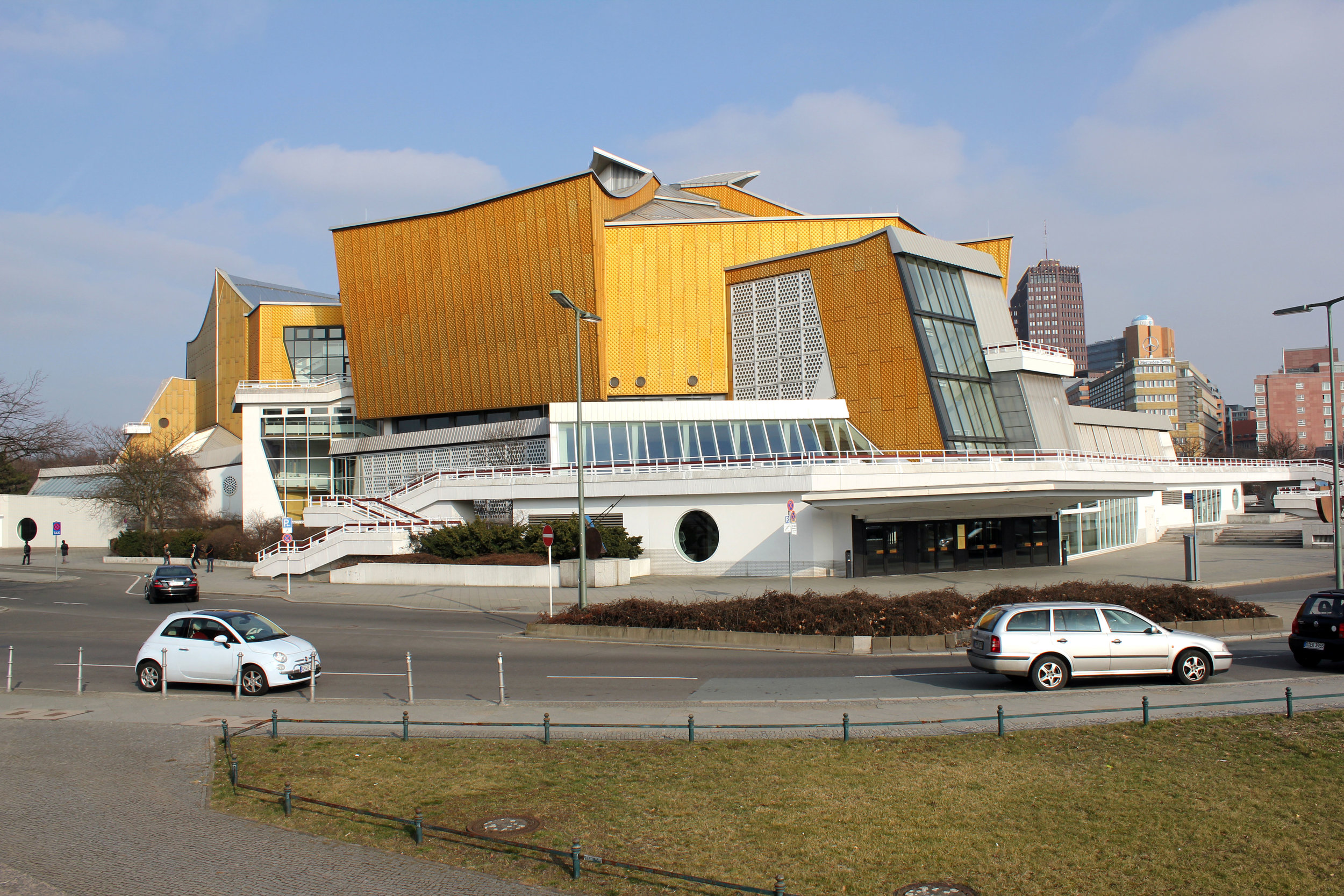
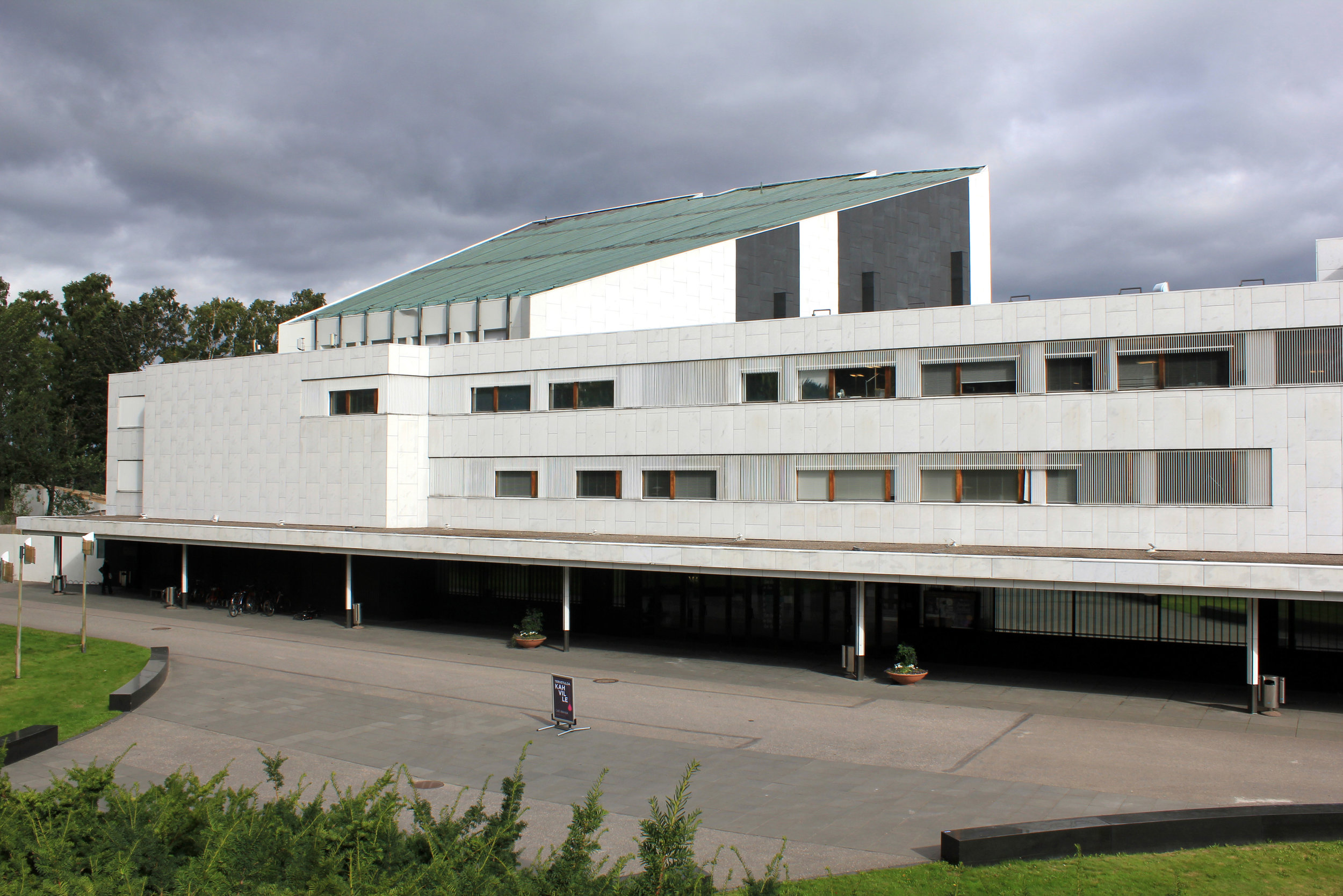
Better late than never! One of the final Rotch Scholar's obligations is to deliver a compilation of his or her travel research to the Rotch Trustees. The compilation is a bound report and available to be printed on-demand for viewing. Following my year (2011-2012) of travel in Europe, I am pleased to announce that the 363-page travel compilation document is available now and covers specified architectural research and itinerary in images, drawings and text. If you are interested in a digital sample (pdf), please feel free to contact me.
Rotch Research / Commercialized Culture
Opportunities in Urban Regeneration and the emergence of new cultural centers have had an unbroken relationship since the end of the second millennium with the arrival of the enthusiast 'Bilbao Craze' and an increasingly expanding image-hungry global culture.
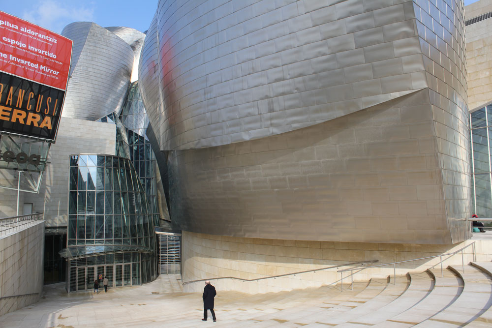
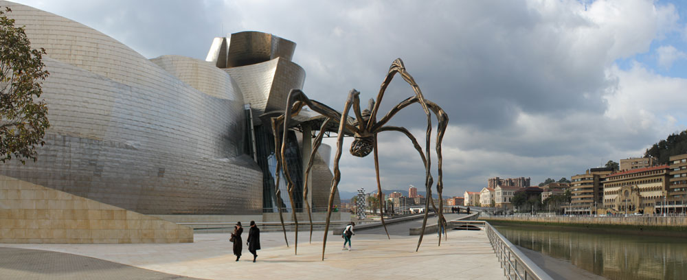
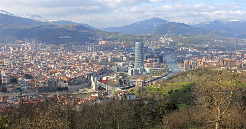
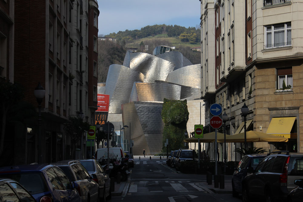
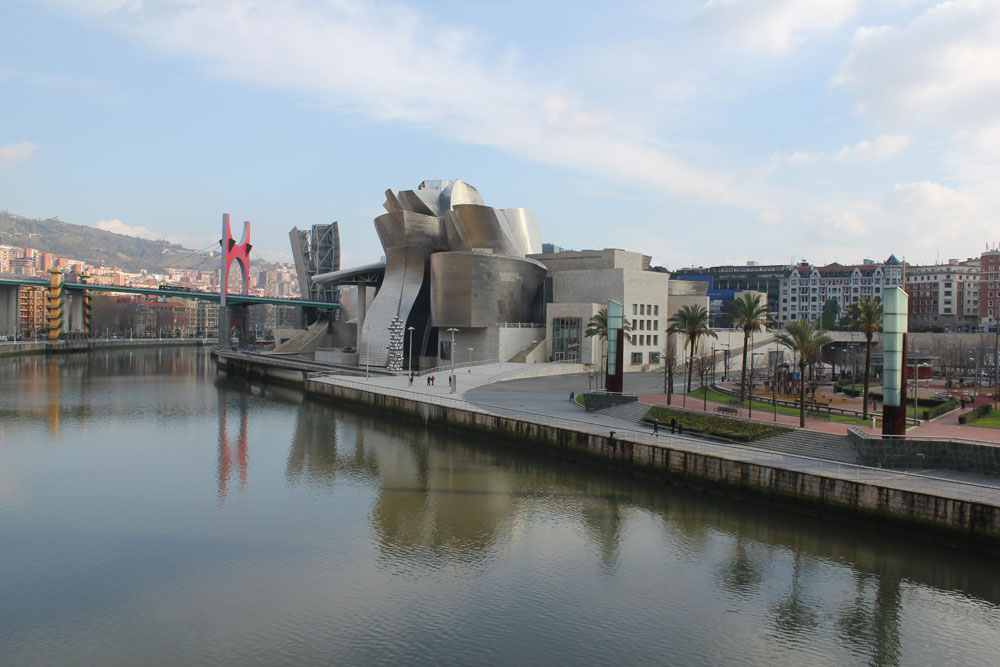
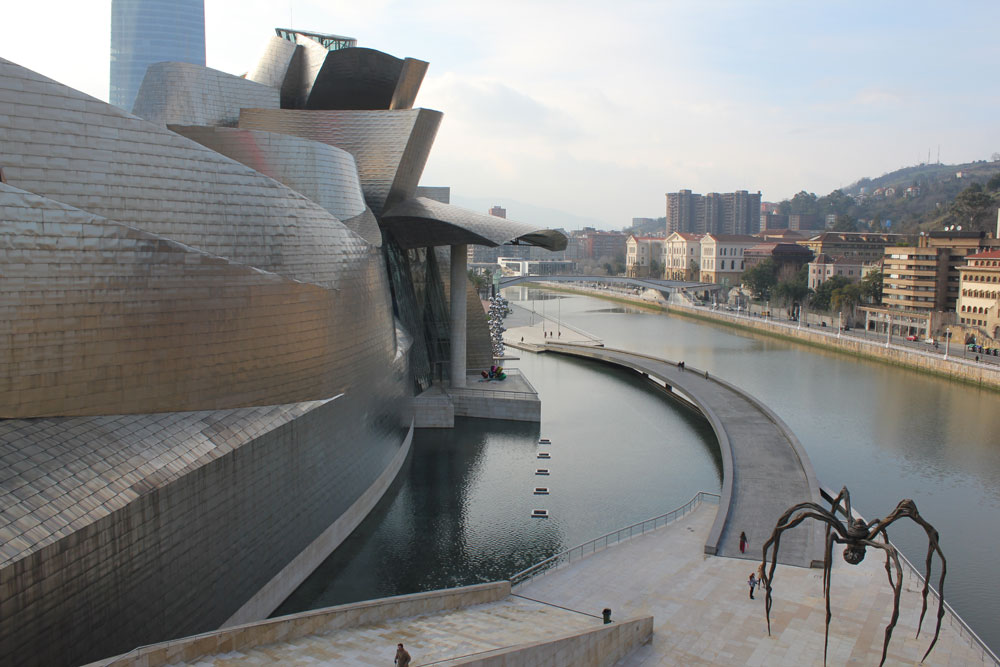
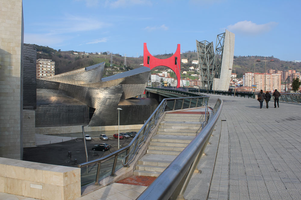
From the moment Frank Gehry's Guggenheim Museum was unveiled along the banks of the Nervion River in 1997, the term "Bilbao Effect" emerged as a battle cry from civic leaders, architects and city planners intent on revitalizing dilapidated city centers and elevating their status in a competitive global market. In fact, there was a reason for elated optimism, as market research reported that Gehry's new structure was bringing an extra 3 million visitors to the city each year, with additional tax revenue and corporate sponsorship invading the flourishing post-industrial region. However, the success of the project would not rely on a single object, but on an inspiring urban strategy that cleared the city's waterfront of old shipbuilding industries and introduced accessible green space that was capable of hosting popular city activities and attractions throughout the year. The city, eager for a museum to compliment the region, gave the Guggenheim foundation complete control of the project throughout the process. The result was an efficient, yet impressive construction. Nevertheless, it was obvious to the media and aspiring cities that the 'icon" resulted in the sudden fortune of Bilbao, elevating an emerging cultural industry in architecture that relies on the shock of iconographic structures for supremacy in a global market.
Thomas Krens
Director of the Solomon R. Guggenheim Foundation
“At some point, when it was becoming clear that the Alhondiga was not going to work as a site, there was this moment when I had this epiphany ... I went past the Bellas Artes Museum and then crossed this bridge to the university ... ran down to the opera house (Teatro Arriaga) and realized that this was, in fact, what I called the geocultural triangle of Bilbao. The fact that the waterfront was in the middle of it at this point was only coincidental.”
Over fifteen years have passed since Bilbao grabbed headlines from all over the world. In those years, the population of urban centers around the world began to exceed those of rural areas and the tourism industry was surging with no sign of abating, leading to an assortment of cities to invest heavily in their cultural infrastructure during the economic ‘boom years’. This initiative was spearheaded by substantial performing-arts complexes (theaters, concert halls and opera houses) and lead to a total metamorphic shift in the live-art industry with efforts to combat inclusion, globalization and a dwindling audience. Now, architects were forced to balance between civic responsibility and a new form of city-branding, with politicians overwhelmingly focused on the latter. After the global financial meltdown in 2008, many of these major cultural projects (some still in construction) - combined with government mismanagement and poor attendance - resulted in intense public scrutiny and questioned the foundation of this surging iconography in architecture. This study will focus on the characteristics and campaigns for new performance architecture in a post-Bilbao environment, with an emphasis on geographically-condensed regions in Europe that traditionally have had regionalist building attitudes.
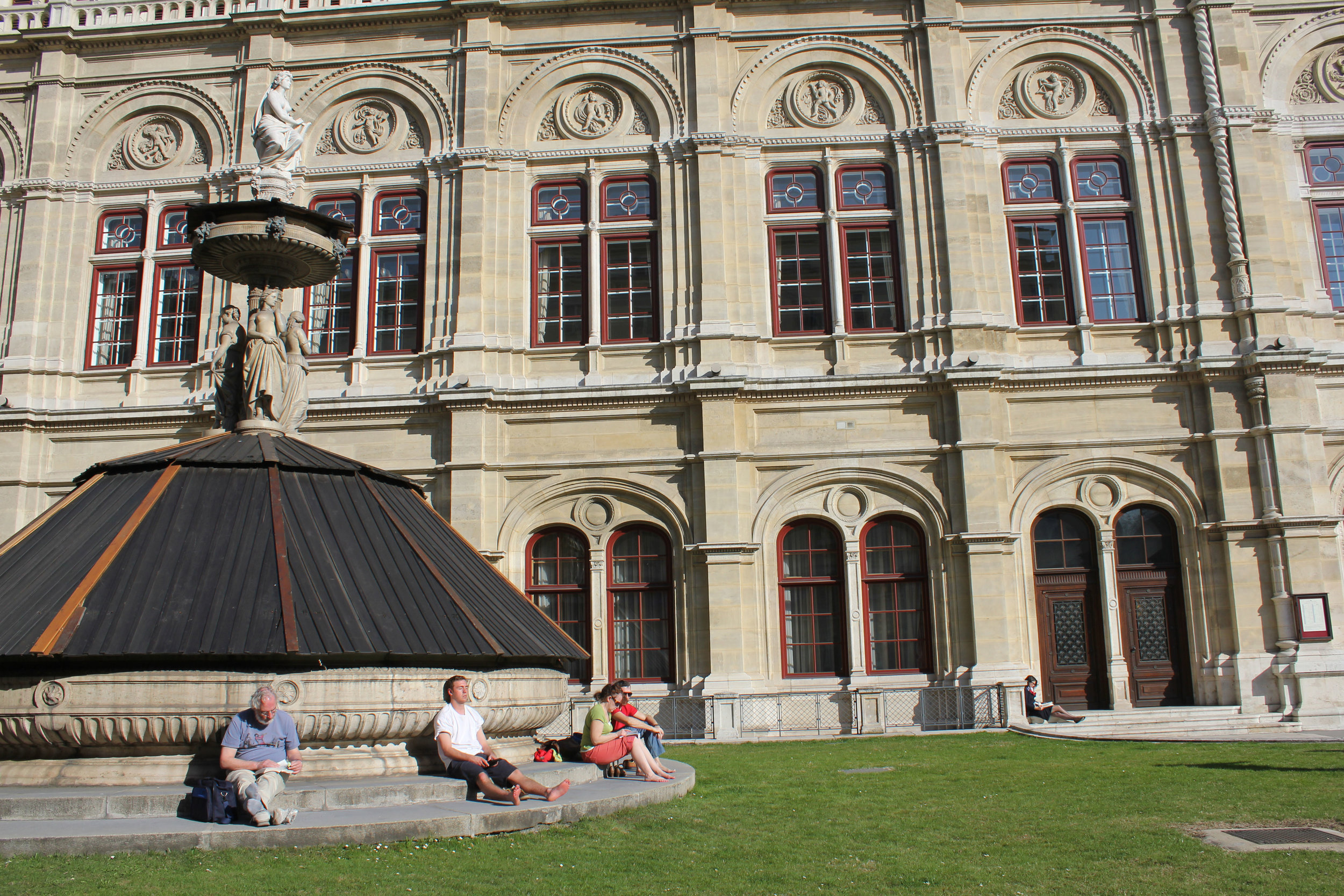
Paris Opera House // Reception Hall
Throughout history, public perception of large performance halls in urban areas have always carried the stigma of being ‘elitist’ - built with the help of public tax funds for the pleasure of the city’s wealthy. European examples, especially from the 18th and 19th centuries, illustrate the problems of inclusion - grand palace-like structures rising on solid plinths, protected from the grim of the urban fabric, but still call out for attention with overly ornate and monumental articulation. No public space available - performance-patrons only (Look, but do not touch). However, as civic structures usually do, these buildings reflect the political and social environment at the moment of their construction. It was a time when Europe saw an emerging industrial age that defined new distinct social and economic classes over the established aristocratic nobility, but still averted the ideas of transparency and inclusion into urban improvement projects. The most notable example would come out of the Great Reconstruction of Paris from France’s Second Empire (1852-1870). Baron Haussmann’s modernization plan, under the direction of Napoleon III, famously revitalized the ailing city of Paris with grand urban interventions - such as wide boulevards and public parks - that aimed to modernize the cramped medieval city. The glittering centerpiece of this urban rejuvenation was a new Opera House (Palais Garnier) - rising from a nefarious neighborhood once famous for prostitution and gambling. The building was planned as one of the ‘key points of the city’ - a significant symbol of imperial power that would connect Parisians both physically and perceptibility between wide promenade boulevards of affluent living and socialization - ultimately reflecting the nature of Second Empire Parisian society. Emphasis of the Opera site in Haussmann’s plan was evident, as it would be centrally located, surrounded by a network of streets and isolated as the terminal axial point of a newly created grand boulevard (Avenue de l’Opera) that directly links with the Louvre Palace - firmly monumentalizing itself as an important site for civic implications, like the Arc de Triomphe before it.
Haussmann’s renovation of Paris 1853-1870 (red)
Paris Opera House (1875)
Charles Garnier’s design for the opera house was chosen after a public five-month-long design competition and would convey Haussmann’s plans with a monumental and eclectic expression of Neo-Baroque values from the Beaux-Arts architectural movement that could be described as excessively ornamental in nature for its time. Garnier’s design reflected a socio-economic shift in Parisian society that no longer relied on endowments from privileged political systems (aristocratic or monarchical). Seeking to become a profitable and self-sufficient entity that attracted a new elite social class, the bourgeoisie would gladly pay for seats and boxes within the opera, unlike the former aristocratic congregation. Culture was now to be bought with money, not nobility. The result was a lavish urban spectacle that successfully put ‘society on show’ in Paris, gaining support from the city’s influential bourgeoisie and immediately became a prominent architectural prototype for countless new performance spaces around the world.
Following the war-torn period of the early 20th Century, numerous European cities were experiencing an unprecedented span of urban reconstruction and economic expansion dominated by variants of modernist architecture, led by the International Style - with an emphasis on simplification of form and material, rejection of ornament, and a honest expression of structure - all by utilizing the acceptance of industrial mass-production technologies. Hundreds of new residential blocks, commercial towers, schools, and other necessary urban projects would begin to develop around Europe, most echoing what Le Corbusier termed “machines for living”. Toward 1960, at a time of unprecedented global economic prosperity and in the wake of a huge financial investment in Western Europe’s need to rebuild and modernize, city officials aspired for cultural improvements that embodied the post-war longing for change and aimed to parallel the rising standard of urban living and new political alignments for international integration (United Nations, NATO, ECSC). Planned cultural projects were sought as an antidote to the impersonal ‘universality’ of the International Style, with design that would become increasingly adventurous. New attitudes in modern language - such as a strong revival in Expressionism and an emergence in Brutalism - offered an aggressive style of architecture that was concerned with an examination of local cultures, urban context and a changing social order with international interests. The result was a slew of performance-arts-based buildings with a consistent underlying attitude of connectivity (between the individual building and its surroundings), composed monumentality (with a sense of human scale), and whole-human experience (enlightening social life by linking interior function and public realm). English architect, Denys Lasdun, would define these guiding principles as an ‘urban landscape’ - significant structures with a strong geometry and pure formal expressions as an intensified moment within its surroundings, containing seamless vital links between the interior life of institution and the public realm.
Sydney Opera House (1973)
However, two decades of idealistic post-war cultural construction would be overshadowed and defined by one project - not from Europe, but from the burgeoning city of Sydney over 8,000 miles away. The Sydney Opera House, designed by Danish architect Jørn Utzon, would be a massive undertaking on a highly visible and centralized site on Bennelong Point in the city’s harbor. Utzon’s design had a pure expressionistic emphasis on form, material and social function - most notably known for the structure of the building’s large white shells. The building instantaneously attained the sort of symbolic significance any project could hope for - on par with the Eiffel Tower or St. Louis Gateway Arch - that not only represented the city, but the nation as a whole. Nevertheless, the Opera House became one of the largest contradictions the building industry had ever observed. One that was seen by many as the most successful and emblematic of its type, but with a disastrous undertaking - famously immersed in economic and political complications from its very inception - taking over a decade to construct with extreme budget overages (1400% over the initial estimate). This led to Utzon’s departure from the project midway through construction and cast a pall on future ‘iconic’ cultural projects. Today, the opera house remains the most valuable asset to the Australian economy (bringing in $775 million a year) and has defined a distinctive brand that has transformed Sydney’s waterfront into the city’s most popular and desired urban district.
The performing-arts center has been redefined for the 21st century. The new generation of buildings must grow out of intricate partnerships among politicians, business entrepreneurs and cultural leaders to create emblematic structures that replicate Sydney’s success and generate increased activity within the public realm. Championing democratized design to a wider audience and staying true to its ancient Greek origins.
Rotch Proposal / Boston Symphony Hall
The Boston Symphony Hall is located on a dramatically tight urban site defined primarily by the congested intersection of Massachusetts Avenue and Huntington Avenue (both major traffic thoroughfares in the city) that contains the Hall's potential in engaging the public as a civic institution.
The proposal explores how Boston's Symphony Hall can dramatically expand the surrounding urban boundaries and compliment the Symphony's world-renowned cultural program. A new civic square is conceived West of the existing Hall - taking over part of St. Stephen Street to allow for pedestrian activity and movement that leads to an elevated plaza over the congested traffic intersection. New program is added South of the existing Hall for new office and recital halls for easier access and availability of natural light - replacing the existing program located underground beneath the existing structures.
Existing Conditions
Site Diagram : Symphony Hall Plaza
Proposed Site Plan : Symphony Hall Plaza
Perspective of design proposal
Boston / An American Counterpart

With successful intergration, the conceptualization of urban arts institutions have become crucial in redefining our cities as a natural source for contemporary thinking - enticing new capital investment and inquisitive residents / tourists - and a primary indicator of the city’s aspirations that speaks wholeheartedly to young and empowering talent in a new global economy. At the beginning of the twentieth century, Boston would experience an unprecedented amount of new cultural construction and philanthropy along the Huntington Avenue thoroughfare - a broad expanse of freshly-repleted land from the marshy wetlands of the city’s Back Bay (1858-1890) - that would introduce such notable buildings as the Boston Public Library (1895), Horticultural Hall (1901), the New England Conservatory of Music (1901), Chickering Hall (1901), Isabella Stewart Gardner Museum (1903), Jordan Hall (1904), Mother Church Extension (1906), the Boston Opera House (1909), and the Museum of Fine Arts (1909). Notably, this manufactured virgin land was an especially highly-desired site for the relocation of the valued Boston Symphony Orchestra from the congested urban fabric of the city’s original peninsula - leaving the Boston Music Hall (Orpheum Theatre) to become the first cultural institution to secure a position in the Fenway area with the new Boston Symphony Hall (1900). This immediate injection of extensive cultural activity - all within a decade of time - brought an opulent style of architecture that had rarely been seen in Boston, neverless the urgency of construction would create an ill-defined and inflexible cultural district along a mile stretch of Huntington Avenue with no collateral space to compliment the merit of their designs. Years later, at the point of Boston’s ‘urban reinvention’ in the 1960s, the Boston Opera House and Chickering Hall (among others) would be torn down from Huntington’s architectural cultural row, replaced by growing academic influences and the new 14-acre Christian Science Plaza - following other large-scale urban interventions throughout the city, such as the West End clearing (1960), Prudential Center (1964), Copley Square (1966), and City Hall Plaza (1968) - all defining Boston’s current urban landscape. In 1998, the city of Boston would acknowledge Huntington Avenue’s prominent position in defining the city’s cultural vitality by designating the section between Massachusetts and Longwood Avenues as the “Avenue of the Arts” with Symphony Hall anchoring this distinction as the earliest and most prominent structure serving the area.
Boston Symphony
“The democratization of space adds an additional dimension to a project: to give an urban sense to an area that needs urban participation. Cultural locations, notably musical ones, have the natural ability of enriching the urban texture, stop the city’s barbarization and give back that extraordinary quality that it has always had in history. ” - Renzo Piano
Since the great wave of construction along Huntington Avenue, Boston has not seen significant civic investment in the construction of a centralized cultural center with emphasis on the performing arts. Adding the new ICA building (2002) - constructed as a catalyst for the redevelopment of the city’s old industrial waterfront (Fan Pier) - along with the additions to both the Museum of Fine Arts (2010) and the Gardner Museum (2011) have been welcome developments to the city’s cultural life. However, Boston - so rich in prominent art institutions and talent - has fallen behind other American cities, such as New York, Miami, Dallas and Los Angeles (to name a few), in recent years with the lack of a flexible, state-of-the-art performance facility that can both engage and invigorate the city. The question: Does a city like Boston need such a building? Recently, the Opera Boston announced it would be ceasing operations after 8 years in the Cutler Majestic Theatre, leading some to wonder if such a performance art was appealing in New England. Some would argue the recessed economy and inadequate facilities would bring on the demise - leading me to wonder if the Boston Symphony Orchestra would have survived if it had never moved to its prominent Fenway site. Regardless, it can be seen the need to reconnect, rather than preserve, Boston’s great performance halls within the urban fabric so that these highly regarded institutions may translate their programmatic successes into engaging civic moments, while also considering a new facility that can cure what Boston Globe’s Jeremy Eichler calls Boston’s “void in the cultural life of a city so rich in other dimensions”.
Case Study / Auditorium Parco Della Musica

The pursuit for a prominent musical complex to showcase Rome’s famed National Academy of St Cecilia (Accademia Nationale di Santa Cecilia) has been an ambitious undertaking - one that has lasted over 65 years of competitions, postponements and uncertainty. In 1936, the historic auditorium (the Augusteo) - and home to the 425+ year-old institution’s Symphony Orchestra - would be dismantled to recover the ruins of the Emperor Augustus Mausoleum buried beneath. In the years that followed, the National Academy of St Cecilia was forced to rent existing structures throughout the city center as it pressed the municipal administration for available urban space to construct a new concert venue. A 1950 design competition considered the expansive and available Flaminio district of Rome as a new home for the Academy, only to result in an indeterminate recommendation from the jury - putting the project in a state of uncertainty for years, though highlighting Flaminio as an ideal and practical location for future development.
Site Diagram : Auditorium Parco Della Musica
Flaminio District's current context
The Flaminio district, located north of the city’s historical center in the curve of the Tiber River, is named after the ancient road of Via Flaminia that leads from Rome over the Apennine Mountains to the Adriatic Sea - a major trade route in the Roman Empire. Excluding the Flaminia road, the flood-prone area outside the Aurelian walls was largely untouched until the end of the 19th century when industrial enterprises overran the region. With the industrial implant established, a period of settlement expansion would occur with an increase of building complexes and road networks. In 1911, city officials selected the Flaminio district to host Rome’s International Exhibition of Art in celebration of the 50th anniversary of the Unification of Italy - initially defining the area’s ubiquitous character as a cultural, entertainment and sporting locality for the city. Following the announcement of the Rome Olympic Games for 1960, Flaminio would enter a new phase of urban transformation as the selected site for the new games - with construction of the Olympic village, Olympic Stadium, and the Sports Palace (along with the previously-built Flaminio Stadium) a catalyst for change in post-war Rome that is still omnipresent today.
Covered entry arcade with access to the site’s public commercial activities (shops & restaurant)
Seating for the open-air amphitheater
In the ongoing effort to alleviate Rome’s lack of adequate venues for classical music, the Rome City Council decided to host an invited international design competition in 1993 for a new music complex. However, such a desired large complex would not be feasible in the very dense historical center of Rome near the Accademia’s prior venues. Therefore, the competition site would be positioned in northern Rome, on a spacious former parking lot site in the Flaminio district - bundled between the former Olympic structures. The Olympic Village extends northward of the site, Pier Luigi Nervi’s ‘Sports Palace’ (Palazzetto della Sport) to the west, and the Flaminio soccer stadium to the south-west. The following year, Italian architect Renzo Piano and the Renzo Piano Workshop were named the winners of the competition with a scheme that offered a modern concept of landscape urbanism to weave the scattered fragments of the Flaminio district. With the completion of the new Auditorium project, Rome’s Flaminio district would again go through another chapter in urban development - one that requalifies the region as a contemporary neighborhood focused on the arts and sports - further emphasized by the recent completions of the MAXXI (Museum of XXI Century Arts) by Zaha Hadid in 2010 and the Ponte della Musica (Bridge of Music) by Kit Powell-Williams and Buro Happold in 2011.
Zinc-shrouded roofs (a material resembling the historic lead domes of Rome)
Sculpted cultural elements composed around outdoor amphitheater and landscape
Auditorium Parco Della Musica / Site Section
The project, later named the Auditorium Parco della Musica (Park of Music), is conceived as an open multi-functional complex to host a variety of musical performances on a decentralized site that benefits from a transportation infrastructure inherited from the 1960 Olympic Games. Not simply a performance hall, but a complete urban condition for music: with three concert halls, large rehearsal and recording rooms, workrooms, a museum of musical instruments, a comprehensive music library, retail shops, gardens, exhibition spaces, offices, bars and restaurants - all radiating around an active open-air amphitheater or ‘Cavea’. Acknowledging activity adds an additional layer to the project - allowing urban participation therefore gives an urban sense of the complex - enriched by cultural nodes (concert halls) that are separated and submerged in the Parco della Musicas landscape, which rolls down from the neighboring Villa Glori. Each one of the three concert halls is understood as an individualistic element, architecturally and functionally separated to facilitate soundproofing and coinciding performances, but aesthetically tied by identical zinc-shrouded roofs (a material resembling the historic lead domes of Rome). It is the placement of these sculpted cultural elements - arranged by size and elevated around the amphitheaters concave stepped seating - that unifies the project’s composition, while the subterranean foyer below directly links the perimeter of the outdoor amphitheater to the Auditorium. The main entrance of the complex from Viale de Coubertin projects a glass-covered arcade with access to the site’s popular public commercial activities (restaurant and shops), while the more intimate park area - complete with playgrounds and grass fields - radiates beyond the halls as a quiet buffer between the complex and the city beyond.
Seating overlooking The ‘Cavea’ open-air theater, named ‘Largo Luciano Berio’
Auditorium Parco Della Musica / Hybrid Site Plan
Risonanze Area
When the project began excavation in 1995, work was immediately halted with the discovery of ancient ruins from a large farmhouse villa dating from an archaic era (6th century BC - 3rd century AD) - not an uncommon occurrence in Rome - consisting of different residential rooms around a central courtyard. The discovery of the archaeological remains delayed construction for a year and triggered a modification in the design with an adjustment to the building layout for integration of a museum for the Roman remains found on the site - proving the project’s fluidity and adaptability early in the construction process.
Ruins preserved within the Parco della Musica complex.
Ancient Roman villa unearthed during construction
Inaugurated in December 2002, the Auditorium Parco della Musica has been considered a healing element in Flaminio’s pocketed urban tissue and Rome’s arts scene. The multi-dimensional complex accommodates the diverse programmatic needs of the city - designed for symphonic concerts, ballets, contemporary music, opera, baroque music, and theater - with potential to significantly expand its range of activities to include different art and performances in support of the Music for Rome Foundation (a joint partnership between the City of Rome, Chamber of Commerce, the province of Rome and the Lazio Region). Recent urban growth, cultural production and historical connotation come together with this new complex to alleviate the urban fracture that was once a neglected parking lot. The whole area can now be considered a new park open to the meandering public - a synthetic and functional continuation of a landscape that stretches between the banks of the River Tiber and the nearby Villa Glori - redefining the Flaminio district as an integral part in Rome’s contemporary aspirations.
“ When cities expand there are always black, untidy holes that then need to be filled in. This is the real gamble of the next thirty years: how to transform the edges of the city of those areas over-looked by urban development. One of the ways of upgrading this emptiness is to create places that bring people together or fill them with collective functions.” - Renzo Piano, architect
Auditorium Parco Della Musica / Site analysis of access, circulation, new development, and points of social engagement
Case Study / Florence Opera House
On the outskirts of the historic center of Florence, the first planned railway network in the city would begin construction in 1841. A new structure (Leopolda station) - located on a clearing just outside the city walls, near the Pignone ‘industrial district’ and Porta al Prato (named after the 1285 gate to the city center) - was to be a train terminus to the new Leopolda Railway, connecting the Tuscan region between the Port of Livorno and Florence. The construction of the station in 1948 would be the culminating piece to the completed railway - leading to great economic and social benefits to the entire region. However, the activity at Leopolda station would be short-lived, as a new link was opened in 1860 between the Leopolda railway and the much larger and centrally-located Maria Antonia station (now the Santa Maria Novella Station) in Florence. Soon after, the diversion of all region and national traffic would lead to the closing of Leopolda Station, but the structure would remain, undergoing a multitude of programmatic changes through time. Since 1993, the old station’s large interior halls were recognized as a perfect location for an adaptable event / theatrical space, now run by a fashion industry promoter (Pitti Immagine) - establishing a new cultural perspective to this old Florentine industrial district.
City Diagram : Florence
Aerial of Florence (new Opera House in upper right)
By the beginning of the new millenium, an effort was underway for the redevelopment of this stagnant area outside the historic center by the ‘Committee of Ministers for the 150th anniversary of the Unification of Italy’, aimed at the realization of major infrastructural, cultural and scientific works to reinvigorate the region and celebrate the country. In 2008, an international competition would be initiated for the new ‘Park of Music and Culture’ multipurpose facility, located in the hinge between the historic Leopolda station, Fratelli Rosselli ring road network, Cascine Park and future Porta al Prato regional rail station - aimed at improving the area with a playful combination of cultural and leisure activities, along with the construction of the new head offices of the Florentine Maggio Musicale - all within the vicinity of the current Municipal Theatre (one-quarter mile away). The large complex would be awarded to Roman architects ABDR Associates with a design that represents a link between Cascine’s natural landscape and the stones of the city center, between history and the future.
New Porta al Prato regional railway station adjacent to Leopolda station
Opera House from Porta al Prato regional railway station
The new site is a transitional point that divides landscape from hardscape, playing a fragile role of integration between a multifaceted boundary of a chronicled city. Along with immediate adjacencies to Leopolda station, the project must contend with Florence’s largest (395 acres) and most popular park - Parco delle Cascine - that invites a natural, porous edge all the way to the Arno River. Adversely, the opposite edge of the site is one that is cut off and impermeable - adored by a large fenced wall and a stretch of tracks - as a result of a new regional railway station built in 2008 that would open adjacent to Leopolda, recycling two rail tracks from the historic station. Primary entry to the site is achieved from the east, along the Viale Fratelli Rosselli - a grand avenue constructed after the elimination of the historic city walls - recently accompanied by the city’s only public light rail line in 2010 with a stop for Parco della Musica.
Parco delle Cascine
New metro line through Parco delle Cascine
Entry to Opera Site (still under construction)
Florence Opera House / Site Plan
Florence Opera House / Building Section : Florence Opera House
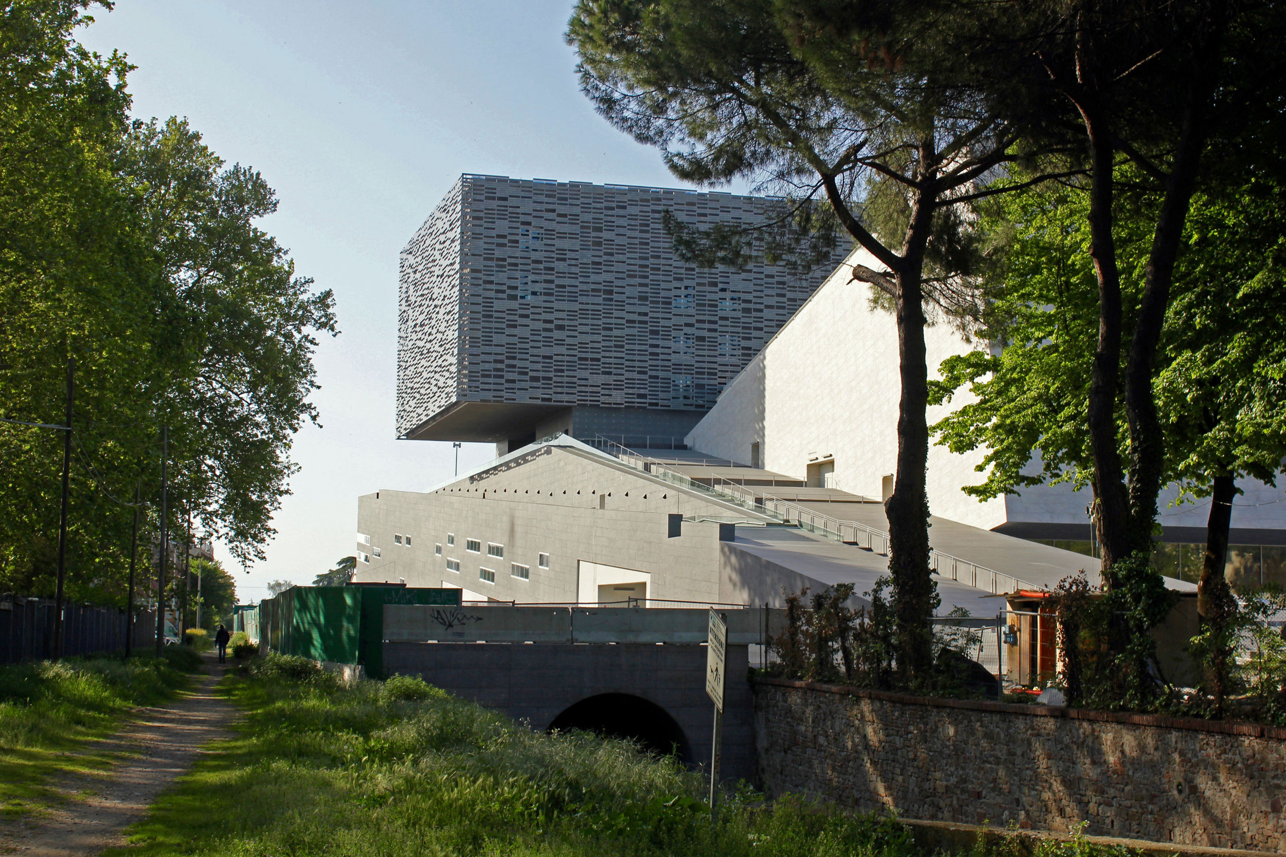
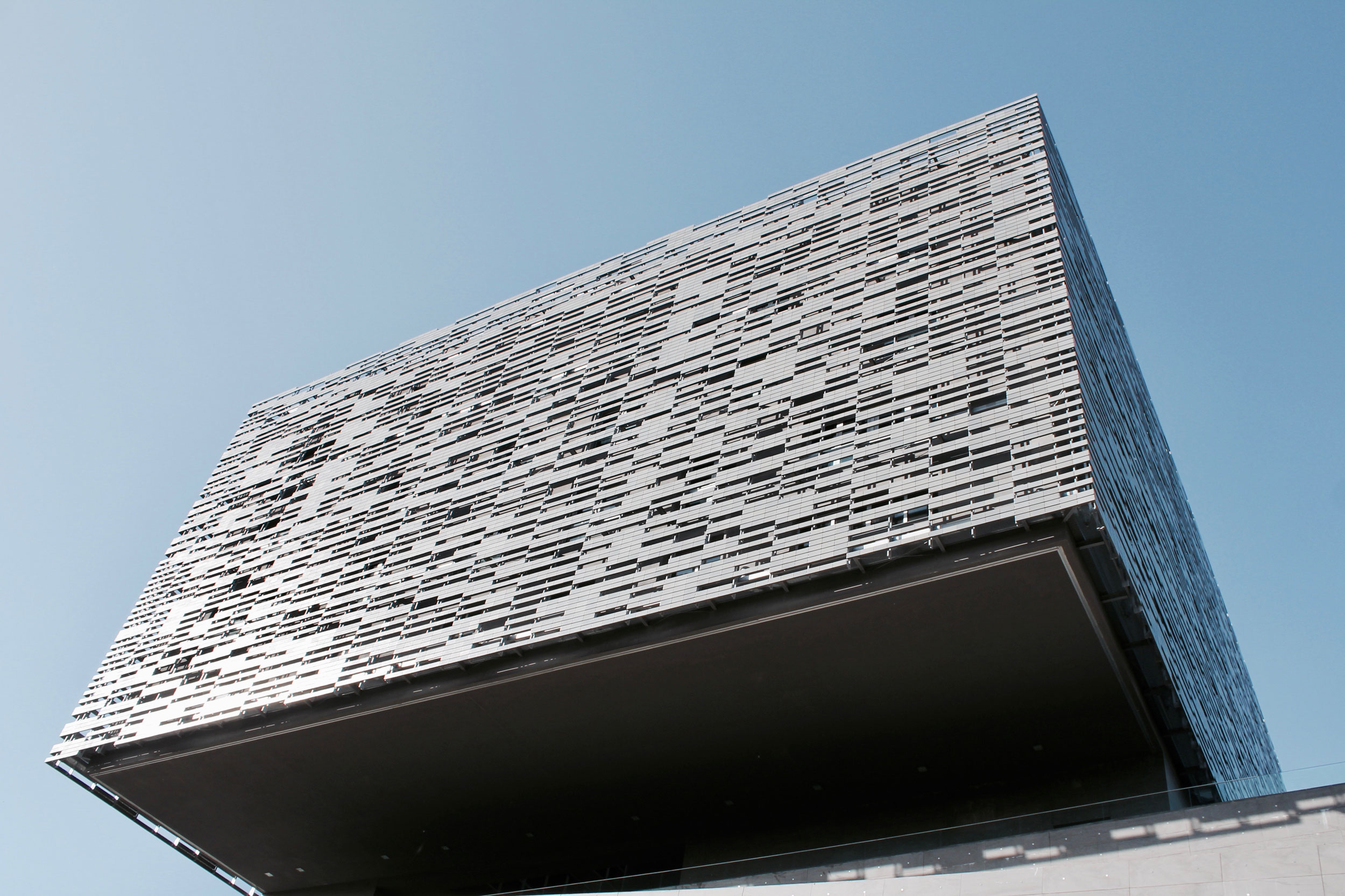
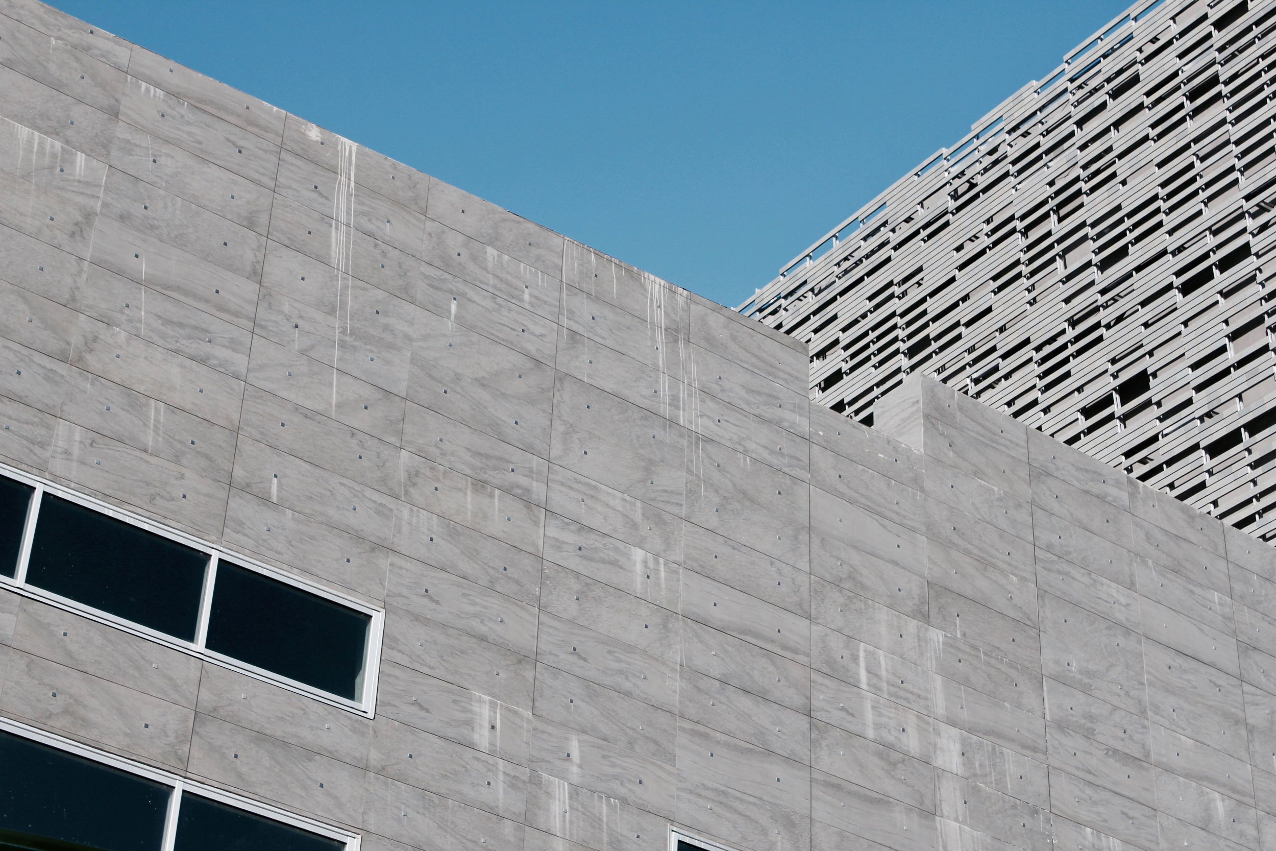
Built in a city considered the ‘birthplace of opera’, the new Florence Opera House is designed as a multi-functional complex with both an urban and architectural agenda. Shaped by wide open spaces and a public perception of openness on an urban scale, the new project not only adds to the city’s public spaces with one of the largest piazzas in the region, but also provides a conceptual bridge between the stone-lined city and scenic landscapes of Cascine Park with a series of terraces and outdoor spaces arranged fluidily along a pedestrian thoroughfare, including the ramped volume of the main hall with terraced seating on the roof for an open-air ‘cavea’ amphitheater space and panoramic views of the entire city of Florence. Beyond, the walls of the fly tower are clad in grey tiles whose identifiable staggering pattern provide an alternating visual awareness of the project as you move through the site. The complex itself is weighted - a massive, formalistic stone construction - containing two large music halls, administrative center, workshops, rehearsal rooms and accomodations for other activities / performances. Together, the imposing architectural clarity of the new structure, along with the pre-existing Leopolda structure and park, form a new urban center devoted to cultural and musical activeness.
Facade Articulation
By the end of 2011, with construction delayed and out of money, the main auditorium in the Florence Opera House would open symbolically with performances for the intended 150th anniversary of the Italian Republic, only to be subsequently closed. Today, the project is in a funding dilemma - needing a substantial amount of money to complete the entire complex - with the Tuscan Region, city of Florence and national governments all slowly trying to contribute during a weakened economic period in hopes of officially opening in mid-2014. Even with insufficient ongoing performances, the site is open - a manufactured landscape to inhabit, stroll and wander - allowing a freedom to experience the potential consummation of the intended program - a ‘factory’ for music and entertainment. Eventually, the city that is making its money on art museums and chic shopping will again identify itself as the birthplace of opera and emphasizing that as yet another reason to visit.
Florence Opera House / Site analysis of access, circulation, new development, and points of social engagement
Case Study / Culture and Congress Center

In 1856, the city’s first railway station was introduced on the edge of Lake Lucerne in order to bring in main line routes from both German and French railways. The selected site of the terminal station was based on unambiguous connectivity with direct linkages to both the boat service piers on Lake Lucerne and to the city gates of the historic urban center - resulting in the waterfront lake location to develop into an imposing urban junction for the city of Lucerne. Forty years later, the station would be deemed inadequate - replaced by a new terminal building to handle the rapid expansion of transportation demands by cause of the introduction of nautical steam navigation and electric rail tracks. This area of Lucerne would embed itself as the city’s active nucleus - generating a perpetual migration of commuters, merchants and visitors to the city’s urban extents. However, following an intense fire in 1971, the historic railway station would be left in unsalvageable ruin - leaving city officials to quickly develop a comprehensive redevelopment plan for the station and consider the future development of the entire lake side region.


Historical Map of city, future site of Lucerne Central Station area in redFormer Art and Convention Center (designed by Swiss architect Armin Meili in 1934) adjacent to the old central train station (right)
With the completion of the new Lucerne Central Station, built in 1991 by the architectural firm Ammann and Baumann, the city of Lucerne began a crucial modernization of the city quarter known as Bahnhofplatz (Station Square) stretching from the new station to Lake Lucerne. The public face of the new project lies in the multi-story concourse with an underground shopping arcade, designed by the architects then employee, Santiago Calatrava, linking the various functions of the city center with the station’s railway platforms. The newly available land between the station and the water’s edge allowed for a potential hub for the local bus system, leading to the landings for passenger ships on the water’s shores. A massive new Culture and Congress Center would be proposed directly east of the Central Station, just below the outflow of the Reuss river, and directly next to it, the University of Lucerne’s new main building is planned as a renovation of the former post office. Together, these contemporary interventions work together to create a refreshingly new city quarter - a reprieve from the historically imposing city center.

Lucerne Central Station


Station Square / Bahnhofplatz (top), University of Lucerne adjacent to the KKL (left), waterfront of Lake Lucerne (right)

In 1980, poor structural circumstances with the former Art and Convention Center (designed by Swiss architect Armin Meili in 1934) would force city officials to shut down the ubiquitous cultural building, leading to the creation of the Concert Hall Foundation - established to explore options and gain support for the city’s future cultural initiative. Nearly a decade later, local resident Alice Bucher of Bucher Publishing, would donate a small fortune to the city of Lucerne to launch an architectural competition for a new concert hall that would occupy the former site of Meili’s historic structure. By the following year, French architects Jean Nouvel and Emmanuel Cattani would be chosen with a dramatic design to project the new center out over the waters edge and onto Lake Lucerene - exploiting the site’s natural advantages while creating an autonomous relationship with its influential neighbors. However, the initial design tested the city council’s comfortability with the proposed project - declaring the line of the lakeshore could not be broken - and Swiss architect, Rodolphe Luscher (who placed third in the design competition), was brought in to takeover the design. Two years later, Luscher would abandon the project, leading Nouvel and his team to be invited back with the only condition that the lake remain undisturbed. The new KKL (Kunst Und Kongresshaus) Luzern would complete construction in 2000 - 5 years after breaking ground - leaving the new complex off the lake’s shores by way of producing a new poroous public expanse between the lake and the KKL called Plaza Europa (Europaplatz), including the original Meili-designed Wagenbach Fountain that had also accompanied the former center. However, Nouvel still believed the main element of the project was the prescience of the lake and if the building could not break the lakeshore, then the lake had to come to the building. Thus, the ground level of the new complex is conceptualized as a ‘water garden’ with shallow strips of water invading the interior from the adjacent Europaplatz, effectively separating the building into three distinct programmatic elements - the Concert Hall, Lucerne Hall and Conference Center/Museum - all unified under an immensely (130,00 sqft) monolithic roof that can be identified from across the lake, marking the building in the rich visual Alpine landscape.


The diverse layout of programmatic elements for the KKL is visually framed on the northern facade between its immense cantilevered roof (projecting more than 100 feet) and the boundless Plaza Europa - accompanied by a six-story glass atrium and outdoor terraces - concentrate your contextual perception toward the historic city center across the river and surrounding landscape. All public access is focused around this point to create a ‘front door’ effect onto the lake. Conversely, the service and administrative areas run along an impermeable southern edge clad in a verdigris metal mesh, defining a definitive boundary for an entry/dining courtyard from the new University of Lucerne’s Main Building across the street. The lakeside elevations (east and north) are composed of multicolored metallic blocks that undulate across the facade in saturated color tones of blue, red, and green - creating an exchange between a vibrant landscape and a dynamic interior. Together, this hefty ultra-structure represents a clear and distinctive break with tradition - a juxtaposition of contemporary ideas all condensed under one roof that harmonizes with the horizontal nature of Lake Lucerne.
“ I travelled to Lucerne and was met by a stunning sight: the expanse of the landscape, of the mountains, of the bridges – I was captivated ... This is an example of framing the landscape. It is a building on an exceptional site, by the lake facing the town. The entire town can be seen from the foyer.”- Jean Nouvel, architect


Currently, the city is embarking on another bold cultural endeavour. Driven by the need to further integrate musical theater and opera performance into the successful Lucerne Festival and the desire to achieve creative freedom through a variable of staging, spatial design and media technologies; the city of Lucerne has started showing interest in an independent building for a flexible and adaptable opera house - one based on the state-of-the-art ‘Salle Modulable’ (Adjustable hall) design. The Lucerne Theater (Stadttheater Luzern) is currently the only professional theater in central Switzerland - located down the street from the KKL - however the 1838 structure is overburdened as a ‘three division house’ (musical theater, theater and dance ensembles) and lacks the space needed to meet the highest international standards for an acclaimed opera house. Led by the Salle Modulable foundation and Lucerne Festival leadership, discussions are ongoing to privately fund the project (estimated to cost $180 million) and hope the addition and close proximity of the new project can mutually stimulate and innovate the cultural partnership of the city.
“This kind of project is most unusual for a relatively small city like Lucerne – not even Paris has a concert hall seating two thousand and boasting such facilities and infrastructure.”- Jean Nouvel, architect

Case Study / Elbphilharmonie Hamburg
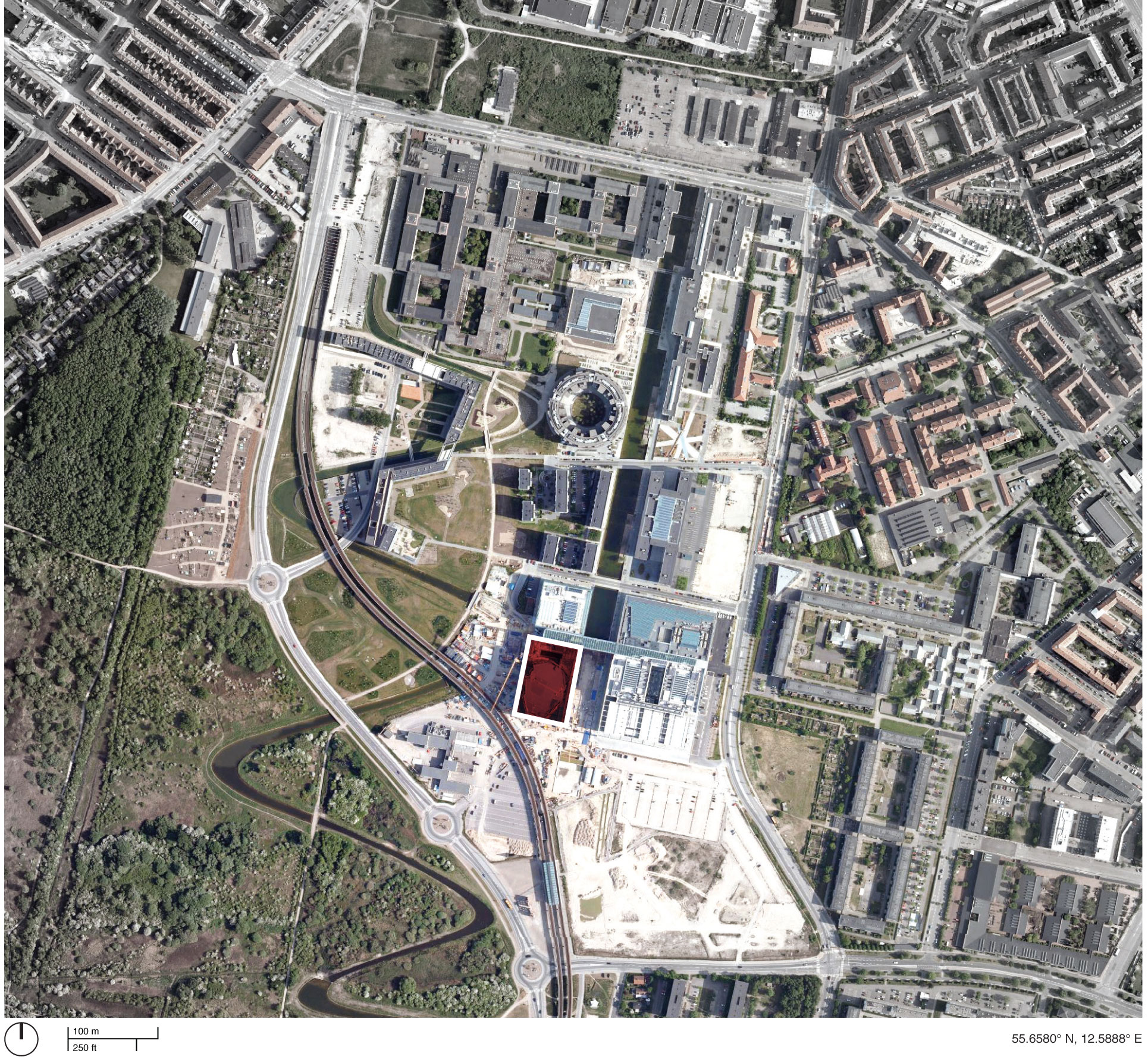
Once the busiest maritime port in Europe (still the 2nd largest), the harbor of Hamburg was starting to slip in an emerging era of globalization with EU free trade, massive modern container ships and increased border security. The bountiful southern banks across the Elbe River would emerge as successor to the city’s evolving ship activity, leaving the impractical historic harbor abandoned by disuse and deterioration. In the mid-1990s, Hamburg’s municipal government determined that the city’s downtown core was in a major need of help - looking for a revigorating urban strategy to combat a continuingly declining inner-city population of just 14,000 residents (peaking around 170,000 in the 1890s) and the adjacent dockland’s depreciation became an opportunistic realization. Located less than a mile away from the city center, the 388-acre industrial harbor was obtained by the city-state of Hamburg in 1997. Following an urban master-planning competition, both KCAP (Dutch firm) and ASTOC (German firm) would be selected to collaborate on the future of this prime inner-city location.
19th century Hamburg port area (future site of HafenCity)
Master Plan of HafenCity
Model of HafenCity
The subsequent development concept, christened ‘HafenCity’ (or Port City), would divide the site into ten districts, each with specifically assigned qualities and limitations. The plan (approved in 2000) allowed for a variety of building types and neighborhoods with the flexibility to adapt to unforeseen circumstances - an innovative approach that allows development officials to facilitate a cooperative of invested future property owners / tenants who procure the design and construction of their own building, attracting local and international architecture firms that leads to a diverse, higher-quality form of living and working conditions. Furthermore, mandated site sustainability requirements ensure quality performance on a site that is known to flood two or three times a year. To provide resiliency from the elements, pedestrian promenade levels are set 15 feet above water level, while street levels are set even further up to 25 feet - effectively separating major vehicular and pedestrian traffic throughout the development.
Current View of HafenCity construction
Currently underway, the evolving $10 billion urban redevelopment effort has been projected to take 25-30 years in implementing all the sub-districts - proceeding from west to east - with a total of 19.5 million square feet of new construction, currently labeled “the largest urban construction initiative ongoing in Europe” and effectively increases the size of Hamburg’s city center by 40 percent. To the north of HafenCity lies the historic 19th century warehouse complex of Speicherstadt, a series of renovated clinker brick-built buildings, allowing an easy transition between the old and the new city. Directly south of Speicherstadt is the neighborhood of Am Sandtorkai / Dalmannkai - the first completed HafenCity district in 2009 - consisting of multi-use developments, a Ship Harbor and a waterfront promenade below cantilevered buildings. On the western tip of the historic pier - rising from the massive red brick framework of a former cocoa-bean warehouse known as Kaispeicher - emerges the identifiable singular structure of the new Elbe Philharmonic Hall (The Elbphilharmonie). The new construction follows the guidelines of HafenCity’s master plan in creating ‘urban magnets’ - strategically located on the outer-perimeter of the entire development, instead of toward the center, in able to shape the discretely independent quarters with specific civic / cultural functions. As the future home to the NDR Symphony Orchestra, the emblematic Elbe Philharmonie vies to become the centerpiece of the new HafenCity neighborhood and give the city of Hamburg a second concert hall - following the opening of the Laeiszhalle in 1908 - with a contemporary design prescience meant to attract international consideration and highlight Hamburg’s recent expansion plans.
Elbphilharmonie and Laeiszhalle : Two venues in the city center under one management
Sandtorhafen (historic harbor) in HafenCity
The Elbphilharmonie : Construction on the western tip of the Hafen-City
Fueled by their recent work in urban regeneration, including the transformation of London’s delinquent Bankside Power Station into the Tate Modern, Swiss architects Herzog and DeMeuron were selected to assemble Hamburg’s new cultural facility that would include (in the spirit of the multi-use development) three concert halls, a hotel and luxury apartments. The selected base of the new design - the historic keel-shaped Kaispecher warehouse - would provide the designers with distinct advantages that would afford the project with robust structural performance and an exterior brickwork fenestration that echos the vocabulary of the historical harbor’s streetscapes. Moreover, the design of the monolithic Kaispecher - built in 1963 by Werner Kallmorgen - is considered to have survived the ‘test of time’ with a playfully modern, yet unbiased abstraction of apertures patterning throughout the entire facade - an ideal plinth for a looming contemporary institution. The new addition - realized as an undulating and multifaceted glass-bodied design - extrudes an identical footprint of the warehouse below and ascents to a maximum height of 328 feet to become Hamburg’s tallest structure in the city center. Ground entry is gained from the east, up an elongated escalator diagonally across the entire warehouse to the former roof of the Kaispecher - now an elevated public square sandwiched between the ‘new’ and ‘old’ elements, offering panoramic views of the surrounding city at 120 feet and entry to the project’s many ancillary areas. Above, the new addition is clad in both curved and textured glass panels (each responding differently to the three main building components), yielding an iridescent visual appeal with the capacity for natural ventilation.The overall composition from the ground mimics a wave-like gem that captures and distorts the animated reflections from both the sky and the water - taking advantage of the projects’ siting from the tip of the old harbor and translating it into an ever-changing appearance. At the core of the ‘crystal’ addition lies an acoustically-reliable concert hall for 2,150 people, hung 160 feet above the river between both the hotel and apartment program blocks. The interiority of the new structure becomes a symbiotic relationship between architecture, logics of acoustics and visual perception - all fundamental ideas that led to an organic tier composition swelling from the boundaries of the concert hall and creating a phenomenological environment throughout the entire project.
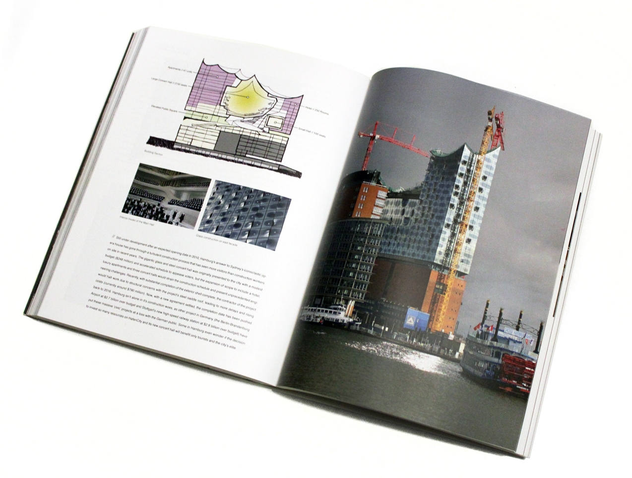
Glass construction on east facade
View down Am Kaiserkai (Street)
View from Landungsbrücken Station
Still under development after an expected opening date in 2010, Hamburg’s answer to Sydney’s iconoclastic opera house has gone through a turbulent construction process that has seen more visitors than construction workers on site in recent years. The gigantic glass and steel concert hall was originally presented to the city with a modest budget ($248 million) and accelerated schedule to appease voters, but the expansion of scope to include a hotel, luxury apartments and three concert halls would strain the construction schedule and present unprecedented engineering challenges. Recently, with substantial completion of the exterior shell complete, the contractor of the project would halt work due to structural concerns with the project’s steel saddle roof, leading to more delays and rising costs (currently around $790 million). Now, with a new agreement settled, the completion date has been pushed back to 2016. Hamburg isn’t alone in it’s construction woes, as other project in Germany (the Berlin-Brandenburg Airport at $2.7 billion over budget and Stuttgart’s new high-speed railway station at $2.8 billion over budget) have put these massive ‘civic’ projects at a loss with the German public. Some in Hamburg even wonder if the decision to invest so many resources on HafenCity and its new concert hall will benefit only tourists and the city’s elite.
Elbphilharmonie / Building Section
“It’s what happens whenever you try to build a world wonder that has never been built before, using new materials in new ways ... It’s the same wherever you go — from the pyramids to the Sydney Opera House — it’s very difficult to keep those kind of special projects in tight budgets.”
Elbphilharmonie / Site analysis of access, circulation, new development, and points of social engagement
Case Study / Queen Sofia Palace of the Arts
From its founding, Valencia has had a dynamic relationship with the Turia River, allowing the city to thrive as an urban nucleus to a maritime network that would connect the Eastern Iberian Pennisula (from the Montes Universales) to the far-reaching Mediterean Sea. However, the resourceful river would also bring unwanted consequences with numerous flooding events affecting the city through its history, resulting in significant property damage and death. Finally - in the Autumn of 1957 - Valencia would experience heavy ongoing rainfall for days that would lead to a catastrophic flood, forever changing the city’s relationship with the Turia River. Nearly three quarters of the urban area would be overrun by the river’s discharged flood waters - displacing thousands of families from their residences and leaving the city without basic utilities to operate for weeks. Over 80 people would lose their lives following the disaster. In response to the tragedy, the Spanish government embraced a bold defense plan to prevent another great disaster in the area. The plan, known as “Plan Sur” (South Plan), was an expensive and colossal undertaking that required diverting the Turia River southwards along a new course that skirts the city’s boundary before meeting the Mediterranean Sea, leaving the old riverbed to continue bisecting the city’s historic city center - lifeless and dry.
The 'Garden of Turia' : The old riverbed of the Turia River, red indicating the location of new opera house
Finished in 1969, the new channel brought relief to a wary Valencian populace, but left the remnants of the old riverbed up for much political debate. In an effort to alleviate traffic congestion, city leadership envisioned the dry sunken earth as a potential site for an elaborate highway system that could help alleviate traffic in the heart of the city. But residents pushed back and vigorously protested the highway proposal, arguing for more green space in the city that would allow pedestrians and cyclists to pass through much of the city without contact to city roads. A decade later, city officials would succumb to public resistance and approved legislation to ‘sanitize the city’ by turning the old riverbed into a network of sunken landscapes, referred to as the Garden of the Turia.
Ricard Bofill's formal garden - complimenting the 'Palace of Music' built within the western edge of Turia Garden
View of Palace of the Arts from the Turia Park
Queen Sofia Palace of the Arts and surrounding vegetation
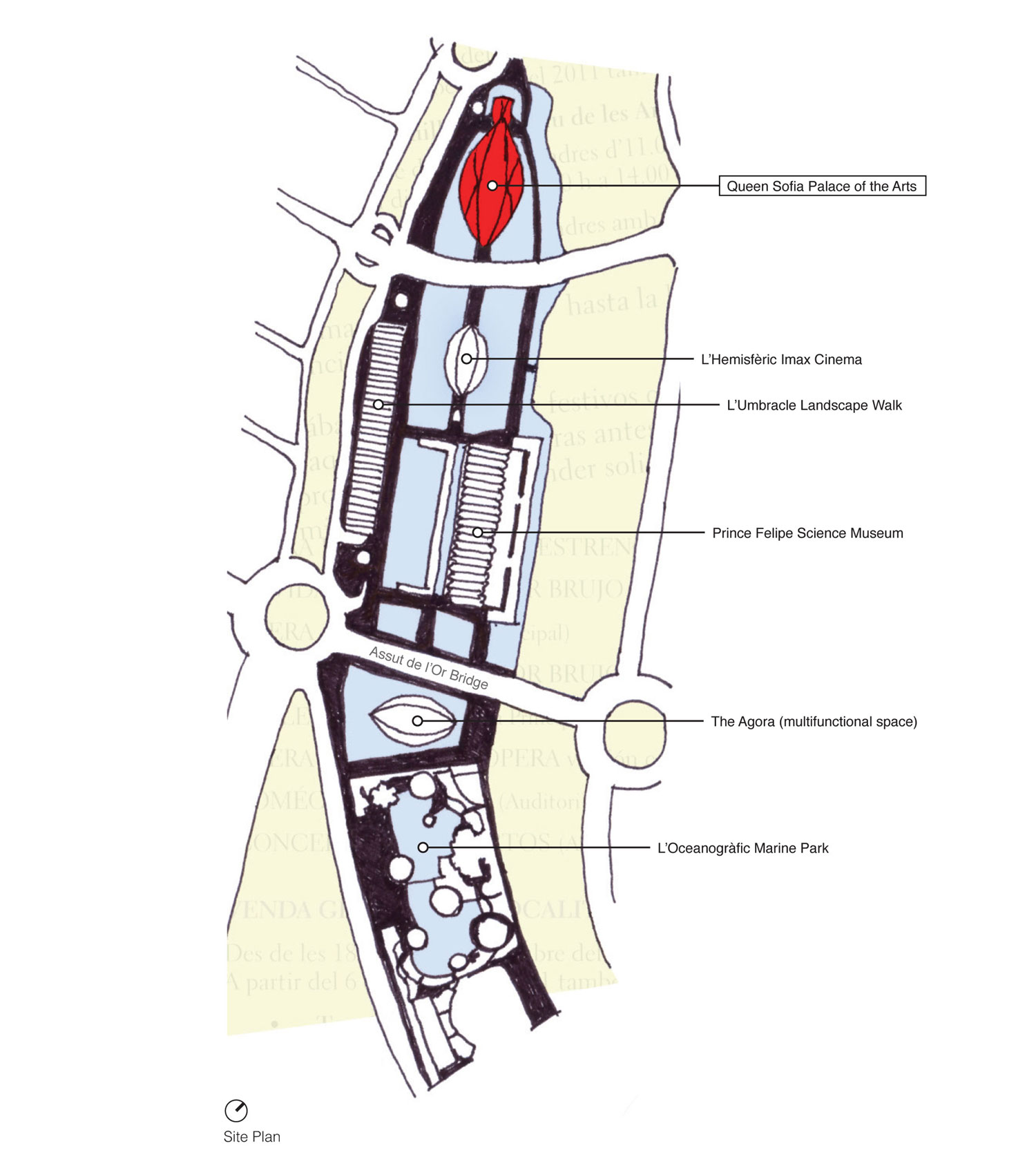
The newly commissioned five-mile green swath in central Valencia was awarded to Catalan architect Ricard Bofill in 1982 to create an initial framework for the proposed 450 acre park. The plan divides the riverbed into 18 zones, each free to formalize its own distinct character by selected local designers, but unified by similar vegetation and water features based on Bofill’s neoclassical concepts along a central longitudinal axis. It would be the decision of segmenting the Turia Park into a sequence of independent gardens that would invite controversy, claiming it impeded the definition of a true global park system - a unifying element like the river water before it. The extents of each park, with an average span of 600 feet from bank to bank, is marked by an existing or new bridge that transverse the green basin, allowing regulated access points for pedestrians and bicyclists to enter the park while allowing vehicular traffic to cross uncontested. Below, a green matrix of pathways, manicured gardens and social spaces (playing fields, ponds, service areas, playgrounds) flourish as a refuge from the daily urban routine. In 1987, Bofill would complete his own series of formal gardens - accompanied by an artificial lake - to compliment the new “Palace of Music” built within the western edge of Turia Garden. The glass dome concert hall by architect José María Paredes would take advantage of the generous green space and become an immensely popular center for musical performances and events, ushering a new cultural renaissance into the city. A few years later, the regional government set out to develop a 86 acre site at the mouth of the dry riverbed - one of the few remaining undeveloped areas - near the coastal district of Nazaret. The Valencian architect and engineer Santiago Calatrava, often called the “native son” of Valencia, would win the commission to develop the entire site. The original plans called for a large telecommunications tower on the land, but government leadership desired ‘cultural clout’ that would rival Bilbao and other Spanish cities. In 1995, the city would begin construction on The City of Arts and Sciences (Ciudad de las Artes y las Ciencias) - a scientific and cultural center that would serve the entire community of Valencia and expectantly attract international attention from all over the world. The massive complex, often referred to ‘a city within a city’, would consist of five key linear elements - an opera house, planetarium, science museum, multifunctional space and marine park.
“The function of arts centers goes far beyond being places for performance ... It is a symbol of the city’s aspirations and a place where people want to meet one another and talk as much as it is a wonderful place to hear music.”
Different sections of the City of Arts and Science complex - all designed by Calatrava
Site Plan of entire Arts and Science Complex
Physical Model of Complex
Built not only to reside as the city’s new scientific and cultural center, Calatrava’s vast and opulent complex manifests a new identity for the historic city center that can not be ignored - both regionally and abroad - creating a heavily transversed urban hub with links to the city’s lower eastern / western banks, an area that had regularly been separated by natural and legislative circumstances. The City of Arts and Sciences responds to traditional nautical Mediterranean culture with a series of diverse pure white ‘fluid’ structures - each with its own concept and aesthetic response - unified by a landscape of pristine light blue reflective pools, a suggestive reference to the ancient river bed and giving a sense to the work as a whole.
Ten years after breaking ground on Calatrava’s ‘city within a city’ the last piece in the grand scheme - the 475,000 square-foot opera house (Queen Sofia Palace of the Arts) - reached substantial completion. Rising 246 feet as the world’s tallest opera house, the massive concrete structure spearheads the complex’s main longitudinal axis, perceptibly linking it across a vast site of concrete and reflective pools toward the adjacent Hemispheric Planetarium and Prince Felipe Science Museum. Calatrava’s design for the opera house, as with most of his projects, forms the structure as the compositional protagonist. By recognizing the project’s diverse programmatic commitment, the design unifies the series of irregular volumes through a comprehensive structural enclosure of two symmetrical concrete shells. The center section of the shell’s surface is cut away on both elevations to expose the substantive elements of the building and revealing curves of subsidiary concrete sweeping around the building’s four primary spaces: the main auditorium (Aula Magistral), a large auditorium, playhouse and multipurpose space. The broad tapered exterior shell - clad in the traditional white trencadis (mosaic of shattered tiles) - in conjunction with Valencia’s subtropical climate allows exterior peripheral circulation along stacked horizontal promenade decks to reach distinct sections of the building - all offering panoramic views of Jardin Turia winding through the city’s historic urban center. Today, the Queen Sofia Palace of the Arts sits as Valencia’s largest landmark (both in visitor impact and overall physical size) as well as one of the top visited cultural complexes in Spain. The opera house has become the climactic centerpiece to a creative vision illustrating the ideas of a new public arena with organic arches, curvalinear forms and vast promenade space - reillustrating the gothic cathedral into a contemporary civic structure within a city that has been defined by medieval architecture.
Building Section
Main Entrance
'Los Toros' Event Area
Reception Hall overlooking City of Arts and Science Complex
The long-winded planning and construction efforts to redefine Turia’s dry riverbed into Valencia’s ‘City of Arts and Sciences’ did come with its fair share of detractors that claimed the planned complex was too grandiose - a monument only to promote the power of the ruling governing establishment, not for the people. By the end of construction, the entire region was beginning to feel the effects of the world recession. The initial cost estimate for the complex ($410 million dollars) would be revealed to have ballooned to a reputed cost of over $1.6 billion dollars by the completion of the project, with some blaming the cost overruns a contributing factor to Valencia’s economic distress. Even the price of the massive complex’s upkeep is said to be consuming more money than the city can handle. Supporters claim the cost overrides are a result of local officials deciding to expand the project significantly from the original plan. Along with the City of Culture, other civic ambitions - from a new marina to a theme park during the boom years - have been linked to the Valencia region’s burdening debt totaling close to 20 percent of its total economy - one of the highest proportions in Spain. Now, once an emblem of civic ambition during Spain’s long economic boom, these new civic buildings now have become a symbol of promiscuous spending and government corruption. To make matters worse, the Queen Sofia Palace of the Arts suffered from a number of setbacks during its inaugural year. Ranging from the collapse of the main stage platform that forced to cancel initial performances and reschedule the entire inaugural opera season, to the entire cultural complex suffering from a series of storm flooding that would lead to water infiltration of the lower floors of the building and destroy sensitive electronic and motor equipment, again leading to the rescheduling of the opera season. “The buildings are like symbols of an era when politician thought we were rich”, says Ignacio Blanco, a member of the opposition United Left party.
Aerial of Valencia (Palace of the Arts in background)
Palace of the Arts / Site analysis of access, circulation, new development, and points of social engagement
Case Study / Casa da Musica
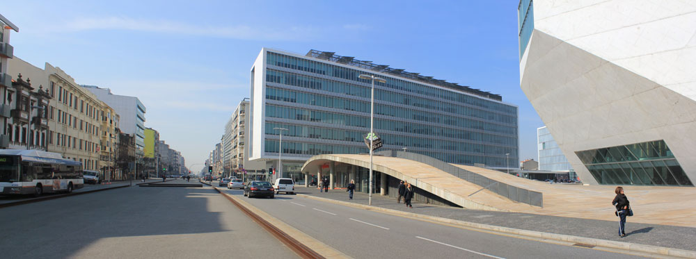
In 1999 the European Union announced that Porto would be selected as one of the two Cultural Capitals of Europe in 2001 (along with Rotterdam), leading the Minister of Culture and the city to develop ‘Porto 2001’, an organization setup to initiate and produce different urban and cultural interventions within the city limits. In light of this event, a restrictive design competition was established by city officials, inviting five international architectural practices to develop a new concert hall and create a ‘symbol’ of the city to be positioned in the historical center of Porto - the Rotunda da Boavista. The new project - The Casa da Musica - was meant to be the big attraction of Porto’s cultural year, but the tight 3-year construction schedule and a prolonged planning process made organizers realize it would be nearly impossible to meet the 2001 opening deadline. Neverless, Rem Koolhaas (OMA) would win the hurried design competition (with two firms not even meeting the deadline submission), proudly recycling an unrealized scheme from his office that was originally conceived as a Nigerian residence turned into a grand concert hall for Portugal’s second city in under two weeks - indicating the unstable and waning relationship between form and function in contemporary architectural thought. Ultimately, the design was preferred for its ability to connect with a much more diverse audience - proposing an adventurous curriculum that included a highly flexible chamber music hall, a cyber-music hall, teaching spaces for children and a multimedia production area - aimed to attract not only the concert-going persuasion, but the rest of the city as well.
Casa da Musica / Site Diagram
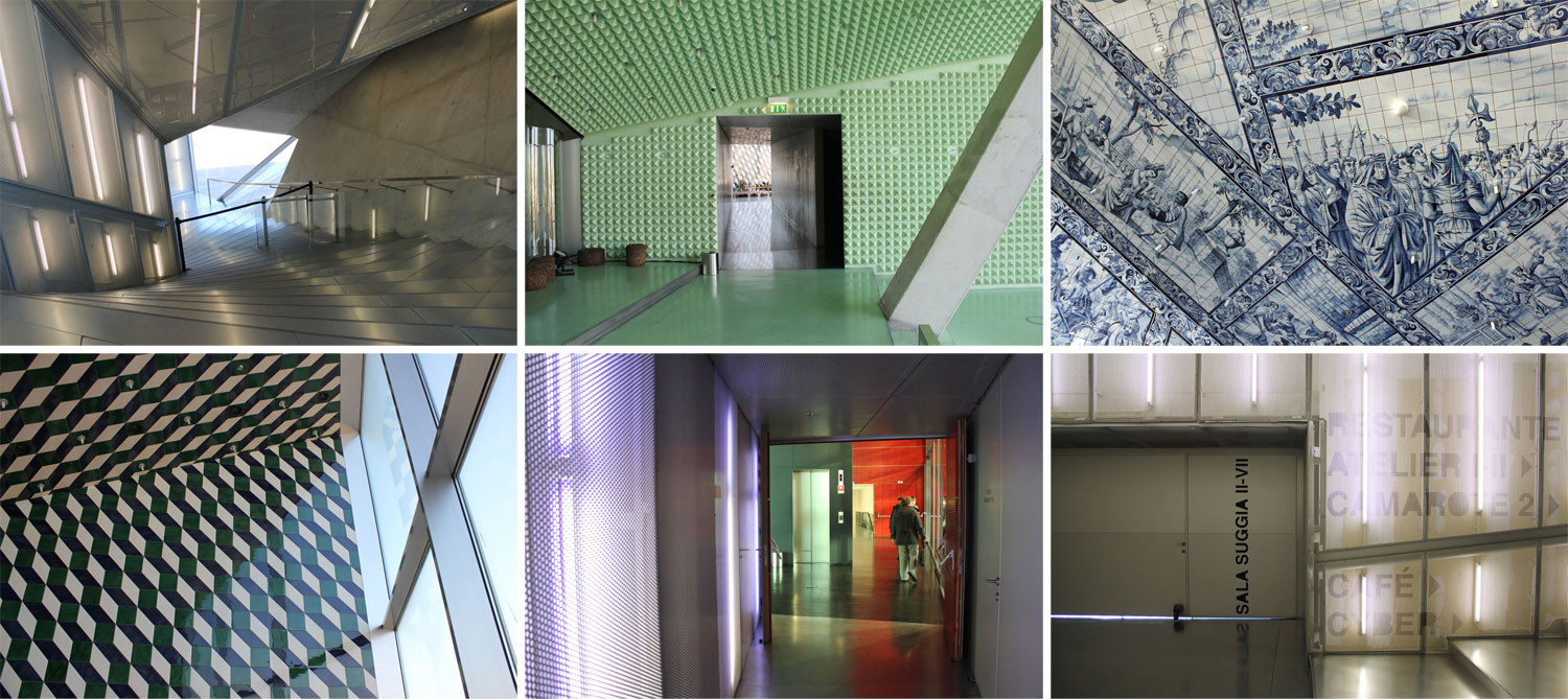
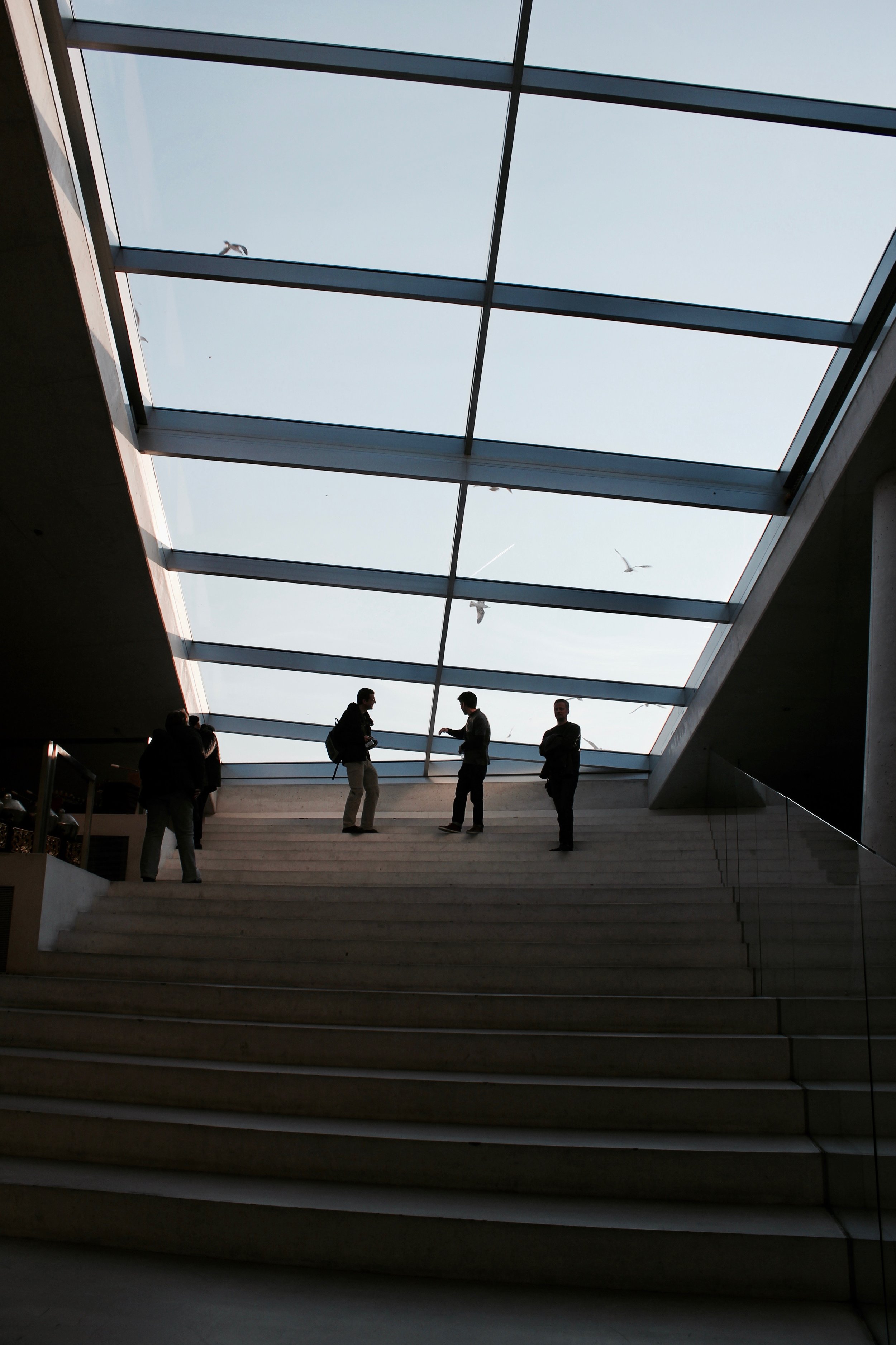
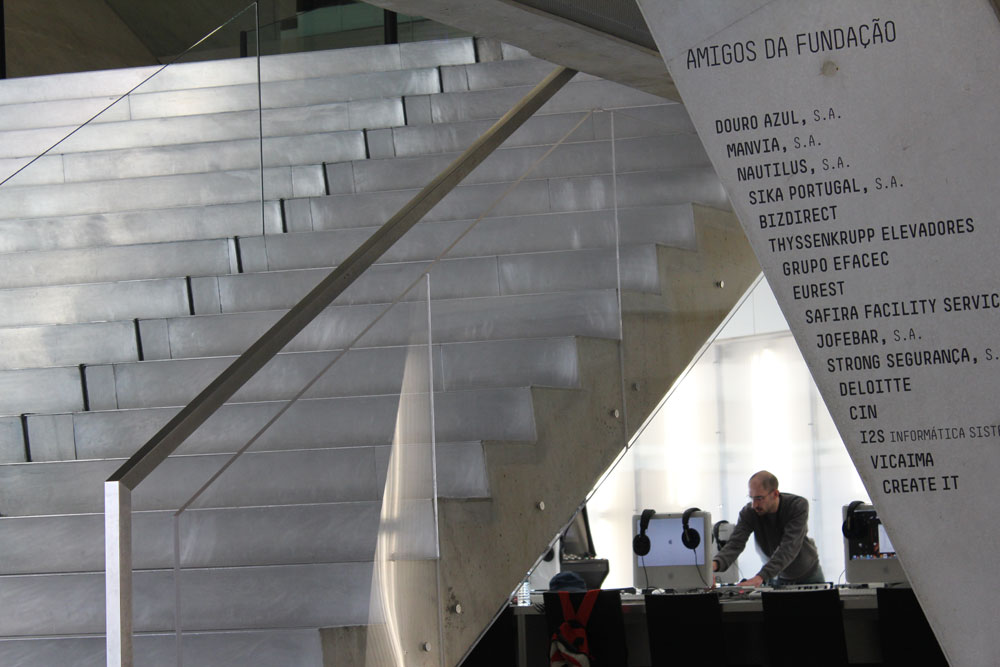
The stairs from the ground-level plaza to the main foyer
Rotunda da Boavista
Eduardo Souto de Moura's Metro Station
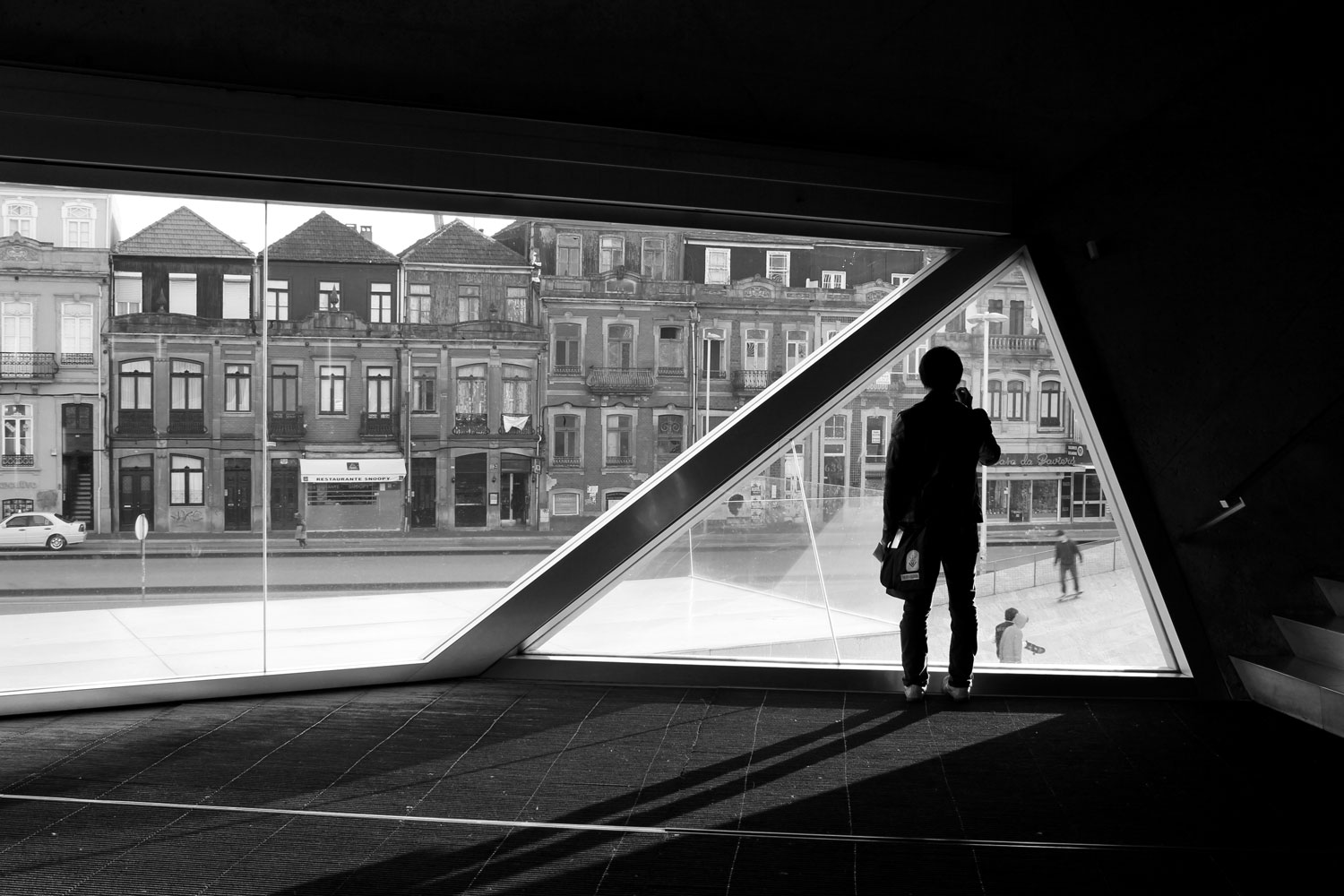
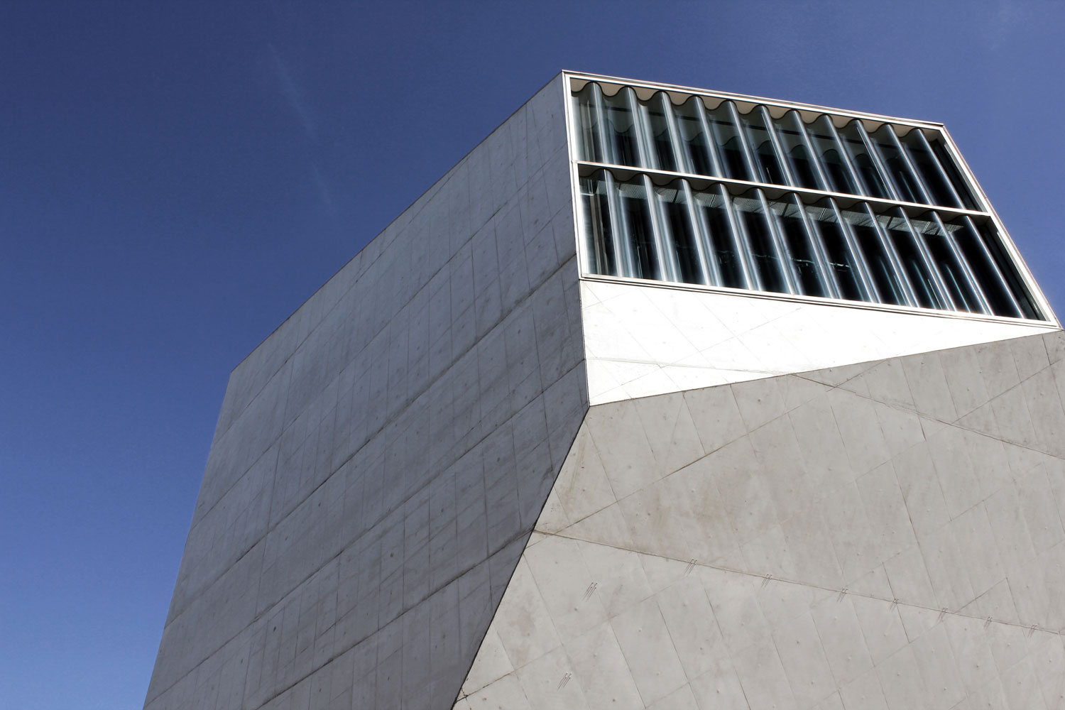
This is clear upon arrival to the completed project, finally finished in 2005 after lengthy negotiations with a myriad of city organizations. The new Concert Hall sits in sculptural solitary, posed in a public plaza of its own creation beside the historic circular Boavista park, punctuated by large windows that overlook public gatherings below. Skateboarders, loitering teenagers, dining businessmen, international tourists, smoking concertgoers (to name a few) - all congregate on the plaza in front of the faceted form, creating a beehive-like effect of activity both inside and out. The building stands on the site of a former trolley yard in a transitional neighborhood between old and new models of the city, connecting the intact historic 19th-century urban core with a new sprawling financial sector toward the Atlantic Ocean by way of a grand avenue (Avenue da Boavista). The new plaza, organically paved in a rusty Jordanian travertine, is an exposed and fluid counterpoint to the rigid angles of the obscure concert hall as it rises up at two corners for entry to both the underground parking and cafe/information kiosk areas. The project becomes an autonomous response, both architecturally and urbanistically, to its charged location and achieves to mediate a fresh relationship between different metropolitan contingents.
“With this concept, issues of symbolism, visibility and access were resolved in one gesture. Through both continuity and contrast, the park on the Rotunda da Boavista, after our intervention, is no longer a mere hinge between the old and the new Porto, but it becomes a positive encounter of two different models of the city.”
Following the completion of the Arrábida Bridge (the largest concrete span bridge in the world at the time) in 1963, a new southern entry point over the Douro River was established in the city, complementing the historic district’s Dom Luís Bridge to the East. The new road bridge was a product of the recently implemented Municipal Master Plan in 1962 - coordinated by French architect Robert Auzelle - to establish a new urban center in the Boavista area to the west of the city. The infiltration of new road traffic to the area strengthened an existing concentration of railroad / tram networks that was established in the late 19th century, based on the French urban design model of large radial urban spaces (roundabouts). At the center of the circular space lies a landscaped and monumentalized park with a memorial obelisk at its center - dedicated to the Peninsular War. The expansion of this infrastructural network has sought to create a western centrality - distinct from the historic ‘Old Town’ to the east - with the area becoming an expansive territory for modern commercial and residential investment (the first shopping center in the city - Brasilia - would open on the Boavista roundabout in 1974) by reason of the economic value of the region near multiple shorelines (Atlantic Ocan and mouth of the Douro River). Today, private initiative has driven the centrality of Boavista (reinforced by the siting of the Casa da Musica in 2005) that extends down an axis toward the sea, enriching the region with private investment while historic parts of the city remain generally dormant.
Exterior Stair / Entry
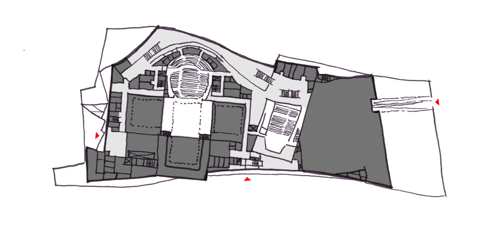
Casa da Musica / Floorplan
Interior Moments within Theater
Staircase in Theater
“Most cultural institutions serve only part of a population. A majority knows their exterior shape, only a minority knows what happens inside.”
While the imposing volume seems rather fastened, the Casa da Musica has an unimpeded relationship between the interior and exterior, with the intention to maximize the link with the public realm through direct visual contact - always enticing visitors in relation to their surroundings and offering them a unique view to the city, sea and sky. The dramatic main entry is put on full display in the public plaza, fronted by a steep flight of concrete steps with a theatrical prescience, seemingly discharged from the large angled sliding glass doors recessed in the large mass, conceding a blurred position of institutional arrival and public contemplation. The same is true for the interior approach that strives to break down the barriers of a typical concert hall to achieve a greater connection between the audience and the artist, allowing a succession of open spaces to visually and physically communicate with the central space (the auditorium) - a notion from the unrealized design of OMA’s private house that required a series of separate zones around a common family room. The concept would work for Porto as it broke open the traditionally closed ‘shoebox’ music hall, creating an exchange between old and new, public and private - two samplings of different cities.
The entire volume of the Casa da Musica operates as a condensed urban container with the ability to absorb any amount of programmatic chaos that the city offers. The main auditorium lays calmly at the heart of the building’s structure, defined by a series of warped spaces and twisting runs of stairs that tunnel through the mass, creating key programmatic elements that seem to processionally erode from the building’s interior and create a socially charged set of secondary spaces (press room, restaurant, children’s room, electronic room, etc.) that compliment the traditional main performance hall. Public circulation is entwined through these interstitial spaces, past soaring angled structural elements, dramatically lit alcoves, and polychromatic interiors - turning the simple act of moving through the building into an transformative kinetic experience that believes in the ‘crush and bustle’ of the audience before the sense of satisfaction during the event. The main auditorium is introduced in a different way, suspended between two massive parallel walls running the entire length and height of the building, it is a completely soundproof device that is able to be seen throughout the building, but not heard. The hall design itself was chosen as a ‘shoebox’ configuration, one that is safe and time-tested, but requires visual association with the city and introduces large glazed openings to each of the end walls - a feature unheard of in performance halls, along with numerous openings for the surrounding secondary spaces that seem to intrude and hang into the main hall, exposing that blurred programmatic break line so common throughout the entire project.
Case da Musica / Site analysis of access, circulation, new development, and points of social engagement
Case Study / City of Culture
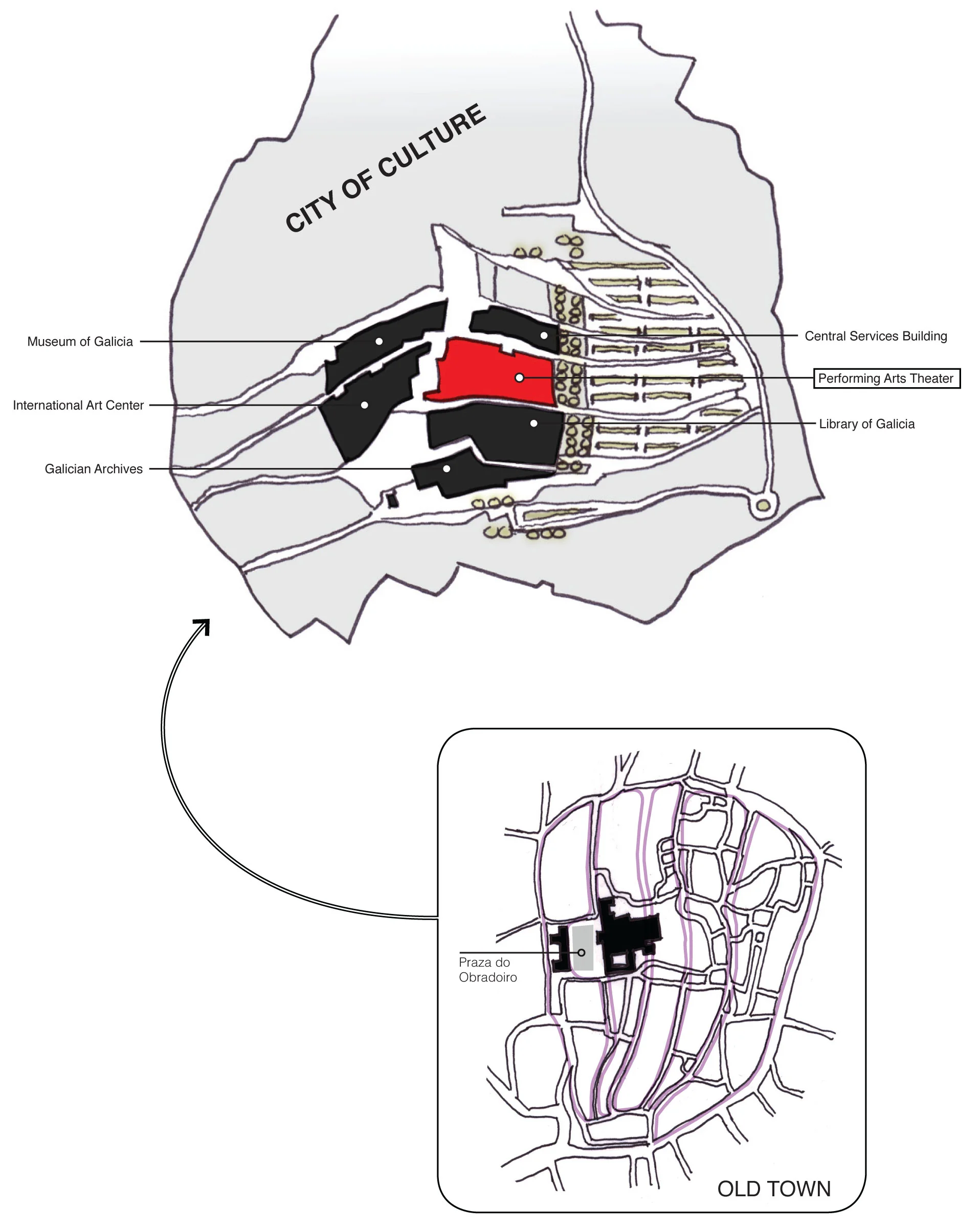
During the mid-1990s - a period of rapid regional competition in Spain with the planning of the Guggenheim Museum in Bilbao and Valencia opening construction on the City of Science and Art - city officials determined Galicia needed to join this cultural arms race and promote the region’s illustrious heritage to the world. In 1999 an international architectural competition was initiated to create a new 1 million-square-foot cultural complex from a list of eleven finalists submitting proposals, all focusing on a beautiful hillside site (Monte Gaiás) overlooking Santiago de Compostela to plan the new ‘City of Culture’. Organizers acknowledged the proposed project would be a new place of pilgrimage toward a 'city of knowledge and creativity', a dynamic addition to a region with a 1,200 year tradition of spiritual passage. The proposal from New York architect Peter Eisenman would eventually be chosen with a scheme embodying an extensive topographical architecture that would relate to the neighboring granite hillsides - an acknowledgment to both an immense building program and the surrounding Galician landscape. The resulting uniquelly-organic design from Eisenman is derived from a condensation of multiple patterns - first from the pilgrim routes that run through the medieval ‘Old Town’ city center of Santiago overlaid on a topographic map of the hillside site. Then, a geometric Cartesian grid superimposed onto the site diagram and extruded using new computer modeling software to create a deformed topographic surface that ripples in the landscape, incorporating old and new contexts into a singular building matrix. The composed massings can seem to have both a smooth and striated tactile quality, a likeness to the symbolic seashell that has defined the city and its history for centuries.
Model exposing the connection between Old Town and the City of Culture
Walking through the City of Culture site, one realizes the figure-ground urbanism of the original medieval city center is superseded to the project’s emerging deformed grid with sinuous surfaces that are neither figure nor ground, but read as one continuous stone-clad architectural composition. The interstitial space between buildings is a familiar presence found in a new form with narrow pedestrian ‘streets’, carved and affected by its relationship to immediate building adjacencies, all emptying out onto a public plaza overlooking the inspiring Santiago skyline. The entire complex celebrates a regionalist expression with local hand-quarried quartzite (in brown, rose, and off-white hues) cladding all the walls and roofs in 20-inch blocks, proving to be hard for quarries to meet demand.
Although Eisenman’s proposal called for eight buildings, today the entire complex is conceived as three pairs of buildings (totaling six buildings in three construction phases), with the Library of Galicia (186,990 sqft) and Galician Archives (155,205 sqft) opened in 2011, followed a year later by the completion of the Museum of Galicia (223,889 sqft) and Central Services Building (80,729 sqft). The remaining two structures, the International Art Center and Center for Music and Performing Arts, are currently non-entities with uncertain futures that operate as two glaring holes in the site due to cost overruns, creating a lightning rod for debate.
Plan of Proposed Music Theater
Site of Proposed Music Theater
It is too early to fully evaluate a complex that is still unfinished, although it has already become a focal point for debate regarding high cost, excessive space, and an ambiguous program. Initially, the brief for the project called for a six-building complex on a 7 million sqft (160 acre) site for a budget of just around $145 million. Expectations were high when the project was launched during the economic ‘boom years’ and competition was fierce (Guggenheim opened years earlier to much international acclaim). 12 years later, under the cloud of the ‘Great Recession’, the first two phases of the City of Culture would be completed at a budget far exceeding expectations ($385 million). Critics would soon unleash their frustration at the entire project, saying it became a symbol of government’s inappropriate spending during one of the worst financial periods in the country’s history (20% unemployment and 9% budget deficit). Meanwhile, the construction of the final two buildings (the Center for Performing Arts and Arts Center) had yet to be started, being continuously delayed due to the economic downturn (along with all building activity in Spain). Of the two buildings, the Performing Arts Center was to be the ‘jewel’ of the complex, planned as the largest building in the complex at 137 feet high and housing over 2000 seats to promote Galicia to the musical and performing arts world. In 2013, with large construction expenditures for the arts not a high political priority and a Spanish economy showing no sign of improvement, the regional governor of Galicia supported a motion to “definitively” stop construction work on the complex, which would need another $228 million to finish. Currently, the City of Culture, Galicia’s answer to Bilbao, is little more than four large under-capacity buildings adjacent to two big holes in the ground. Last year, 330,000 would visit the Galician site that craved so much attention, compared to over a million visitors for Bilbao’s Guggenheim during the same period. It is an unfortunate result of bad economic timing and high (maybe unrealistic) ambitions that have halted this monumental task, but though still unfinished, it creates a pure architectural landscape that is unique in the world and can been seen as a serious investment to the region of Galicia.
“Instead of the ground’s being conceived as a backdrop against which the buildings stand out as figures, we generate a condition in which the ground can rear up to become figure, the buildings can subside into ground. It is a new kind of urban fabric”
City of Culture / Site analysis of access, circulation, new development, and points of social engagement
Case Study / Guggenheim Museum Bilbao
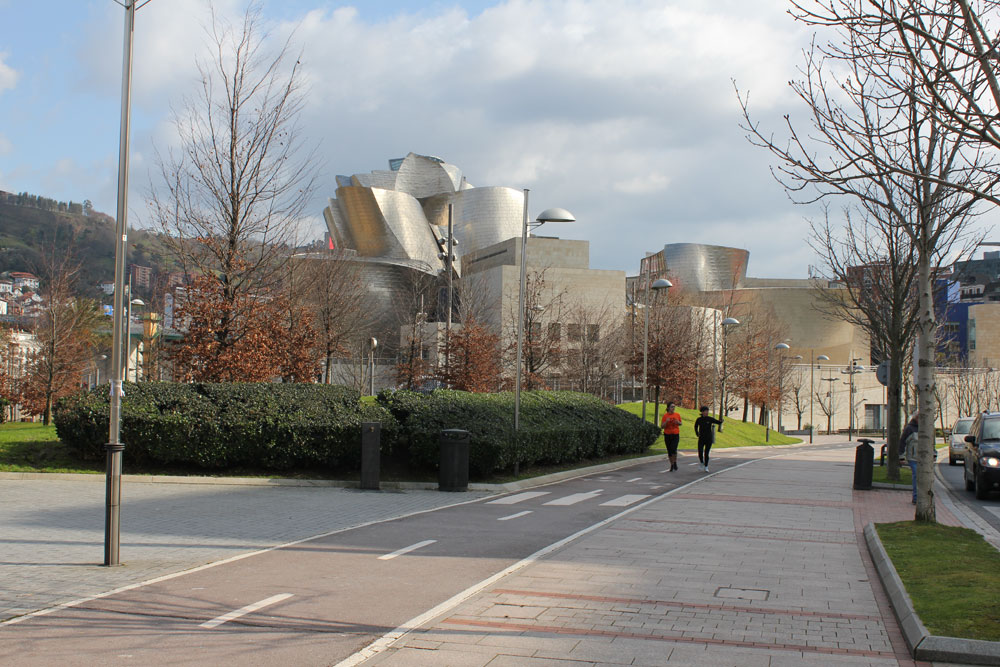
From the moment Frank Gehry’s Guggenheim Museum was unveiled along the banks of the Nervión river in 1997, the term “Bilbao Effect” emerged as a battle cry from civic leaders, architects and city planners intent on revitalizing dilapidated city centers and elevating their status in a competitive global market. In fact, there was reason for elated optimism, as market research showed Gehry’s new building bringing an extra 3 million visitors to the city each year, with additional tax revenue and corporate sponsorship invading the flourishing post-industrial region. However, the success of the project would not rely on a single object, but on an inspiring urban strategy that cleared the city’s waterfront of old shipbuilding industries and introduced accessible green space that was capable of hosting popular city activities and attractions throughout the year. The city, eager for a museum to compliment the region, gave the Guggenheim foundation complete control of the project throughout the process. The result was an efficient, yet impressive construction. Nevertheless, it was obvious to the media and aspiring cities that the “Icon” resulted in the sudden fortune of Bilbao, elevating an emerging cultural industry in architecture that relies on the shock of iconographic structures for supremacy in a global market.
“At some point, when it was becoming clear that the Alhondiga was not going to work as a site, there was this moment when I had this epiphany ... I went past the Bellas Artes Museum and then crossed this bridge to the university ... ran down to the opera house (Teatro Arriaga) and realized that this was, in fact, what I called the geocultural triangle of Bilbao. The fact that the waterfront was in the middle of it at this point was only coincidental.”
Over fifteen years have passed since Bilbao grabbed headlines from all over the world. In those years, the population of urban centers around the world began to exceed those of rural areas and the tourism industry was surging with no sign of abating, leading to an assortment of cities to invest heavily in their cultural infrastructure during the economic ‘boom years’. This initiative was spearheaded by substantial performing-arts complexes (theaters, concert halls and opera houses) and lead to a total metamorphic shift in the live-art industry with efforts to combat inclusion, globalization and a dwindling audience. Now, architects were forced to balance between civic responsibility and a new form of city-branding, with politicians overwhelmingly focused on the latter. After the global financial meltdown in 2008, many of these major cultural projects (some still in construction) - combined with government mismanagement and poor attendance - resulted in intense public scrutiny and questioned the foundation of this surging iconography in architecture. This study will focus on the characteristics and campaigns for new performance architecture in a post-Bilbao environment, with an emphasis on geographically-condensed regions in Europe that traditionally have had regionalist building attitudes.
Case Study / Kulturhuset (The House of Culture)

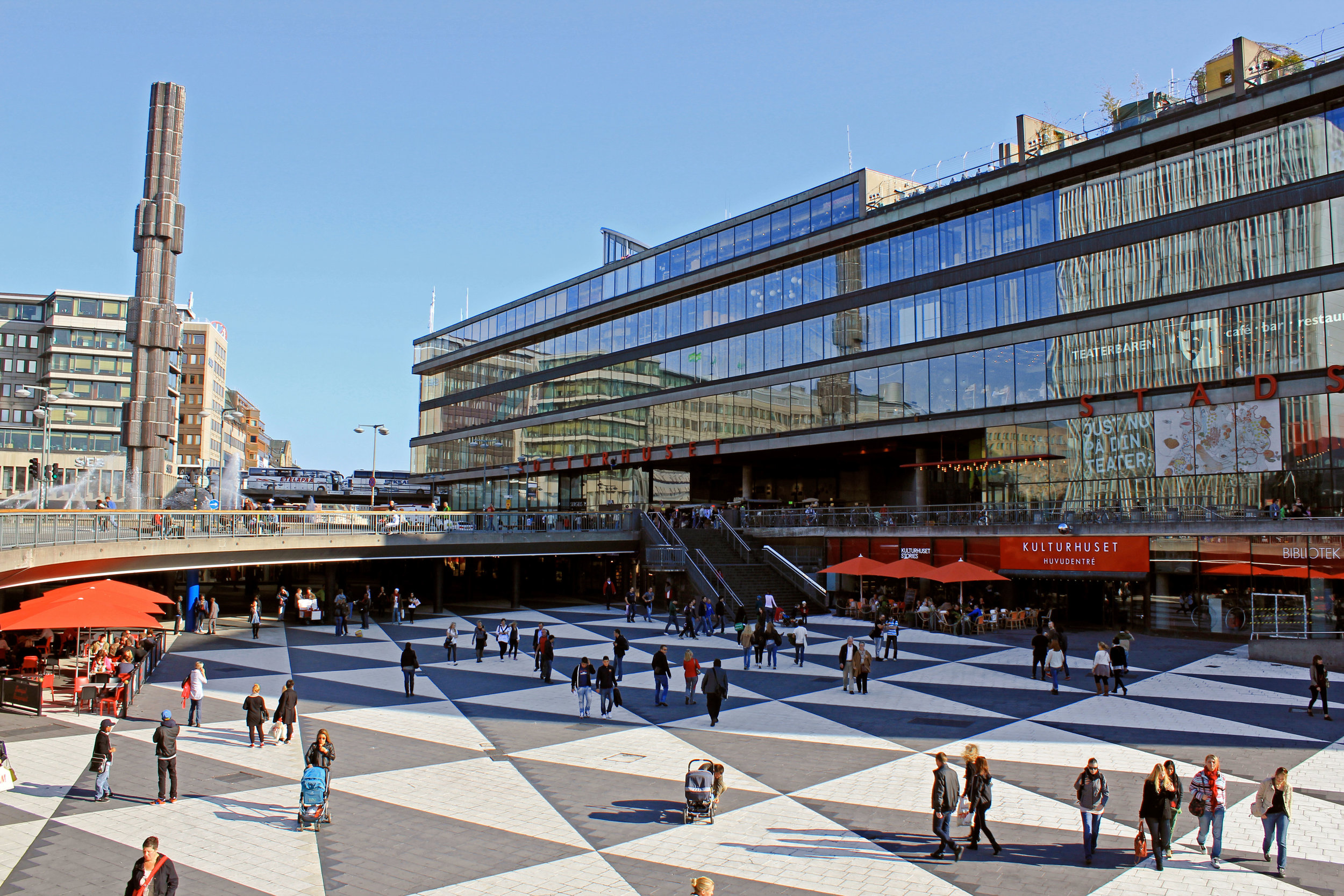
During the 20th century, the population of Stockholm had exploded and the city center was no longer able to facilitate the rapid growth. With the controversial City Plan of 1946, a radical modernization project was launched to transform the old Norrmalm district of the inner city into the new modern heart of Stockholm - creating new underground metro networks, wider traffic infrastructure and new high-rise developments, at the cost of extensive and unpopular demolitions that had plagued the city through the 1950s. The new district that had emerged consisted largely of modern commercial buildings and business activities, including the Hötorget office and commercial center that had been directly inspired by emerging modernist projects such as the Lever House in New York City. The new commercial district would form around the heart of the reconstruction - a new large square, referred to as Sergels Torg, which addressed the city's continuously increasing traffic loads and the concept of separating pedestrian and car traffic, with a new sunken pedestrian plaza (the Plattan) connecting the city's popular pedestrian shopping street of Drottninggatan with the new infrastructure and commercial developments.
Sergels torg under construction, 1966
Peter Celsing's project proposal, 1965
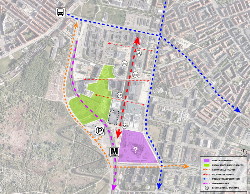
Aerial of Site (Current)
Consequently, to counteract the commercialism of the inner city redevelopment, the Municipality of Stockholm in association with Pontus Hultén, the influential founder of Moderna Museet, launched an architectural competition in 1965 to create a cultural center within Sergels Torg. The competition's brief asked to create a cultural institution with heavy urban and national implications, including such programs as theatres, galleries, cultural activities, and premises for the central bank of Sweden. The winning entry entitled 'Kulturhuset' was proposed by Peter Celsing, the chief architect of the Stockholm Tramways and a leader in the city's modernist movement. At a time when city redevelopment was becoming increasingly unpopular in public opinion, the project sought to rationalize and humanize large-scale construction by creating an 'open shelf', transparent multi-purpose building in which visible interior functions take the place of traditional ornament, allowing the institutional building to have an atmosphere of the street coupled with the possibilities of a cultural workshop.
Sergels Torg's sunken pedestrian plaza articulated with a triangular pattern, referred to as "The Slab"
Pedestrian avenue through the Hötorget Office and Commercial Center toward Sergels torg

SL Tram at Sergels torgIn 1974, the Center would be constructed to the south of Sergels Torg according to the proposed competition scheme, realizing an accessible seven-story shelf unit mounted on a solid concrete wall, deemed as a "cultural living room". The Swedish Parliament (the Riksdag) had decided several years before on changes to the parliament building, as a result of the abolition of the upper house. With the withdrawl of Moderna Museet's future expansion, half of the Kulturhuset would then be intended as a temporary Parliament Building while the original on Helgeandsholmen island was being remodeled into a one-House legislature. What was intended to be the major stage of the City Theatre was rapidly transformed into a main governing chamber and with the state government as a future tenant, the building’s finances were on a safe footing during the development of the project.
Following the completion of the Cultural Center, two additions would soon follow. As the commercial limb of the Bank/City Theater/Cultural Center complex, the Bank of Sweden turns its back on the unifying concrete wall of the Cultural Center and presents an impervious, grid-like granite façade towards Brunkeberg Square and the city's old town. Directly west to the bank, the city theatre is assimilated into the existing urban fabric, while the other two elements stand out as objectified, representative buildings. The complex closes the main north-south axis of the city, and is sited on the historical boundary between the old town and the nineteenth-century commercial district. Celsing preserved this distinction by attaching the bank and the cultural centre to opposite sides of a thick ‘service’ wall, which symbolically represents the ancient city wall.
Underground commercial mall east of the pedestrian plaza underneath a fountain roundabout
Pedestrian passage through the Kulturhuset toward Brunkeberg Square
Aerial View of Sergels torg
The concept of Kulturhuset represented a new architectural ideology rising in Sweden, closely identified with the social reform movement of the early twentieth-century. However, by the date of completion, the period large housing projects in Stockholm and Sweden, including the large-scale brutal redevelopment of the civic center, were brought to an end. Protests against slum-clearance policies implemented without the consent of the public reached a culmination with the so-called "Battle of the Elms" in 1971. Kulturhuset would become the controversial figurehead to the public unrest, but the architectural composition would be sufficiently robust to survive both a tough childhood and confused adolescence by strength in functional performance. And now after thirty-eight years, the building has been taken back by the public - a department store for culture - with the openness and generosity of Sergels Torg, exposure of cultural activities outward to the square, and connective tissue to a layered shopping mecca, making its presence significantly felt in the modern center of the city.
“I am building for a new human being who has to come”
Diagram: Analysis of site access and movement, new development, and points of social engagement
The Royal Dramatic Theatre (Dramaten)
Royal Dramatic Theatre from Nybroplan
Since 1909, The Royal Dramatic Theatre has been the national home for the dramatic arts - sited in a popular public space in central Stockholm called Nybroplan ('New Bridge Square'), which faces the Nybroviken waterfront and connects a number of major urban throughfares in the city. The Art Nouveau / Neo-Baroque building was designed by Swedish architect Fredrik Lilljekvist that, at the time of construction, was criticized for being too ornate for the Scandinavian city and excessively over budget.
Site Plan
View of the Dramaten from the busy Lebanon Meza (Street)
Along the Nybroviken waterfront
On the Stairs of the Royal Dramatic Theatre
Down the pedestrian-friendly Nybrogatan (Along the Dramaten)
Berzelii Park (Across from the Dramaten)
Aerial of site
The Royal Swedish Opera (KUNGLIGA OPERAN)
The Royal Opera House from the Norrstrom river
The first opera house in Stockholm would open in 1782, located in the center of Sweden's capital city in the Norrmalm district of the city between Gustav Adolfs torg (city square) and the Kungsan (King's Garden) - adjacent to the Royal Palace and along the Norrstrom river. The original opera house, now known as the Gustavian Opera, was the work of architect Carl Fredrik Adelcrantz and commissioned by King Gustav III (who would later be assassinated in the same building ten years later). The opera house would serve the city for a little more than a century before being demolished and replaced at the end of the 19th century (1899) by the present Royal Opera House (Kungliga Operan), also known as the Oscarian Opera. The Operan would be Swedish architect Axel Johan Anderberg's first big commission (1889-1898) that utilized parts of the old opera foundations and left the main entrance on the square. The fairly traditional, quasi-neo-baroque architecture would utilize Swedish granite and Limestone at the exterior of the street level with rose-tinted stucco above - keeping a strong axial relationship in line with the main entrance.
Site Plan
Royal Opera House from Kungsan (King's Garden)
Kungsan (King's Garden)
Gustav Adolfs torg (city square)
Interior of Operan's Auditorium
Site Aerial
Case Study / Finlandia Park (Finlandia Hall & Helsinki Music Centre)
As a young, war-torn country isolated in northern Europe, Finland began the 20th century as a nation looking for an identity; with the ability to communicate regional cultural values and a nationalistic character, embracing a hostility to all things Russian. A famous nineteenth-century painting by Edward Isto titled 'The Attack' in which a white-gowned young Finnish woman defends her country's law, as an emblem to its independence, against the Russian Eagle, would loom large in the national psyche. The situation would intensify just as a young Alvar Aalto came to Helsinki to study architecture. The city became the epicenter of events that led Finland to declare independence from Russia in 1917, only to be drawn into a civil war the following year, involving pro-western Aalto into numerous battles with pro-eastern forces. The subsequent victory for the independent nation would shape the future of the Finnish cultural community and influence Aalto's nationalistic position on architecture.
Decades later, as a response to the old center of eastern-influenced Senate Square, community leaders were of the opinion that an independent Finland needed a central square of its own in the new, self-proclaimed center of the city around the vicinity of the recently completed Parliament House, a building that symbolizes the status won in 1917. It was a coincidence that right in front of the Parliament there lay a large railway freight yard which was to be resited elsewhere; an older Alvar Aalto thought that this area would provide a unique opportunity for the realization of an idea, originally suggested by Eliel Saarinen after the civil war. By the end of the 1950s, after countless alternative plans were proposed and numerous competitions reviewed, the planning committee would entrust Aalto with the task of formulating a central plan for Helsinki. The resulting master plan, encompassing Helsinki's Töölönlahti bay, proposed a terraced square with a variety of civic buildings placed linearly along the waterfront, partly on ground and partly on water, to allow an open view of the bay through the buildings. The area in front of the Finnish House of Parliament was envisioned as an open central area that acted as a new active center, concentrating the economic and cultural needs of the community, while connecting the eastern and western parts of the city. However, the plan became a piecemeal development under much debate, with only the concert and conference house of Finlandia Hall to see completion, leaving the only building in an imposing position in its relatively natural surroundings. His master plan, first presented in 1961, would never be carried out in its entirety, but Aalto's ideals on a new urban landscape based on a humanistic design approach that enhanced the progressive and democratic nature of the city, would give relevant and realistic possibilities toward the future use of the site.
Edward Isto's "The Attack" (left), The original central area plan by Alvar Aalto with Finlandia Hall in red (right)
Map of Helsinki showing Senate Square (blue), new central square around Töölönlahti Bay (red) and supporting civic buildings around the area (purple)
Finlandia Hall
As the only piece to materialize from Alvar Aalto's central Helsinki master plan, Finlandia Hall represents a larger vision for the city; built on democratic values, cultural aspirations and strategic siting. One of the last projects to be overseen by the influential architect, the project was split into two phases, with the concert building constructed in 1967-71, and the conference wing four years later. Finlandia Hall can be viewed as a building with two sides, different in scale and character; one toward the bay (east) and the other toward Hesperia Park and Mannerheimintie street (west). The principle entryway, facing west, is a sculpturally winding facade with expressive and humanist aspirations that is married with the natural settings of Hesperia Park, following Aalto's thinking that one should always enter a building through nature as a singular experience. Conversely, on the 'public side' of the eastern facade, the distinct staircase foyers of the concert building and its terraced lobbies oriented toward Töölönlahti bay create a collective setting for public events, once thought to support a proposed urban landscape as a square for social engagement, completely free from vehicular traffic, unfortunately now faces various degrees of undefined land parcels and an abundance of surface parking. The commonality of the project comes from the building's material expression, as the prevalent use of the white Carrara marble not only becomes a contrasting element to the black granite interior, but more importantly generates an influential link to Mediterranean classicism culture, a move that Aalto believed gave Finland the right to exist in western cultural society.
Site plan of Finlandia Hall
Western reception portico off the busy street of Mannerheimintie
Finlandia Hall's eastern entry portico and car ramp
Parking lot to the east of Finlandia Hall
Töölönlahti Bay and Hesperia Park
Following the completion of Finlandia Hall and the abandonment of Aalto's proposed axis of public buildings to the north, Hesperia park's importance in the urban fabric would grow as one of the largest and most popular public parks in central Helsinki. Having a symbiotic relationship with Finlandia Hall; a building designed with intentions to preserve the surrounding landscape, the park would encourage a refuge for pedestrians to be led away from the narrow sidewalks of traffic-heavy Mannerheimintie road, creating a much larger area for exploitation of pedestrian traffic. The surrounding area of Töölönlahti Bay would be left almost untouched up to the end of the 20th century, acting as a natural threshold between the city center to the south and numerous civic developments around the area, including the 1952 Olympic Stadium complex, Linnanmäki amusement park, Helsinki City Theatre, Finnish Museum of Natural History and Aalto's House of Culture. However, in 1993 a new Opera House would be built on the site, flanking Hesperia Park to the north and providing the Finnish National Opera and the city of Helsinki with a state-of-the-art facility. The completion and success of the Finnish National Opera House would put into motion something that Finlandia Hall and Alvar Aalto started years earlier; a strong pedestrian-oriented cultural center for the city. Five years later, the Museum of Contemporary Art Kiasma would open on the southernmost site of Töölönlahti Bay based on an incremental planning process. Designed by Steven Holl Architects, the building was envisioned as an element that would dovetail with the urban structure of the city as well as with the natural environment of the park's surrounding landscape, creating a linear progression of major cultural institutions along Mannerheimintie road and a foundation for a more ambitious development plan.
Pedestrian paths along the shores of Töölönlahti bay
Finnish Opera House on Töölönlahti bay
View of Kiasma contemporary art museum from the north
Töölönlahti Redevelopment & Finlandia Hall Renovation
The Töölönlahti area would become among the most prominent regions in the Helsinki city centre by the start of the new millennium. As a former state railyard, flanked by Helsinki's central train station and Parliament House, the southern section of the site offered city officials the land and the potential for a new dynamic urban square, embracing the cultural and recreational attitude that has evolved in the area for years. The new master plan, developed by the City of Helsinki, calls on Töölönlahti Bay to become what Alvar Aalto and his fellow compatriots once envisioned for the city, an utopian centre of cultural activity and a "living room" for the Helsinki people. Energetically refered to as Finlandia Park, the new development will grow from a southern extension of the bay, from its present shorelines to behind Finlandia Hall, with a shallow water element further extending all the way to Kiasma. A new concert hall is introduced across from the Parliament House, further enforcing a cultural presence along Mannerheimintie road, while new residential and commercial blocks are planned on the eastern perimeter, acting as an urban wall between the city's rail system and the proposed park. Public congregation and movement would therefore be seen in the plan's central axis, along the park's new shoreline, further enforced by a oval-shaped dance pavilion and the new Helsinki central library. After the completion of the new concert hall (Helsinki Music Centre) in 2011, Finlandia Hall is now undergoing most of the work in the area with an expansion/renovation to adapt the Hall to its new role in the site. Plans are to remove the car ramp and parking area from the building's eastern side, facing Töölönlahti Bay, leaving room for pedestrian use and accommodate a terraced café, which will be open to the public apart from serving Finlandia Hall’s functions. The parking spaces, which now occupy the back of Finlandia Hall, will be moved to a new underground parking facility that will serve all nearby buildings, effectively freeing the ground plane for more pedestrian-oriented activities. Within the next decade, it will be interesting to notice that some of Aalto's then too utopian ideas for central Helsinki will finally be realized – 35 years after his death.
The conceptual site plan illustration for Finlandia Park, provided by Helsinki City Planning Department
Rendering of Finlandia Park from the north, with Finlandia Hall on the right. Image from Helsinki City Planning Department
Helsinki Music Centre
Since its completion in 1971, Finlandia Hall has served as Helsinki’s main classical music concert venue. Unfortunately, persistent acoustic problems would plague Aalto's acclaimed building, making it out to be more of a conference venue than a concert hall. Moreover, despite repeated and persistent efforts spanning the past century, Helsinki has never had a true orchestral concert hall specifically designed and intended for the performance of symphonic music. However, after the much-debated detailed town plan for the Töölönlahti Bay area was accepted in 2002, an architectural competition was announced for a new Music Hall that would reinforce the new component master plan. The Helsinki City Board chose a site located in front of the Parliament House, a site that was historically valuable, loaded with symbolism and ultimately controversial as demonstrations would develop in support of the existing structures in the area, leading to a mysterious fire that would ultimately destroy everything on the site.
The winner of the competition, entitled ‘a mezza voce' (with moderate volume) by LPR Architects, was the most subtle, influenced by a fundamental Finnish appearance with an authentic choice of materials and a composition that pays homage to Functionalist design. Ideally, the project sought to be open and accessible to its environment, but it would ultimately be limited by its location. Because of the tight restrictions of the master plan concerning building height in the proximity of the Parliament House, a large part of the program is squeezed underground so that it almost seems to be bowing down to its surroundings. Following the completion of the Music Centre, Kiasma Park would soon follow, creating a terraced 'wedge' landscape that connects the new theater to Kiasma museum and, ultimately, to the future develop of Finlandia Park. Finlandia Hall would change as well, as most performances have now moved to the Music Centre, focus is more on its other role as a congress centre, serving as a venue for government events, trade fairs and exhibitions.
Helsinki Music Centre from the south
Interior view of the Helsinki Music Centre, looking to the north over the theater cafe
View of northern entry to Helsinki Music Centre
Kiasma Park from the south, with Parliament House (left) and Helsinki Music Centre (right)
Kiasma Park - Looking west toward Parliament House
The Planning of Töölönlahti Bay area is a story with two distinct chapters. One believed in a harmonic, but comprehensive plan dictated by the natural surrounding of the Finnish Landscape. The other, an incremental approach to planning through competitions, eventually formalizing a binding master plan around an artificial landscape. Both, Finlandia Hall and the Helsinki Music Centre, can be said to represent these two different sides of Helsinki's cultural center, although each share the importance in creating a civic environment based on a Finnish geo-political aspiration. It is hard to say how successful Helsinki's proclaimed 'Finlandia Park' will be, in terms of civic engagement and urban aspirations, as construction continues to take over the historic rail yard. But, the power lies in the inclusion of residential/commercial components, along with programmatic-led events, that encourage a diverse undertaking in combination with the Finnish nature ideology to create the assumed role of Töölönlahti Bay as the new monumental center for the country.
Site Diagram / Core of pedestrian site approach and movement
“In the days before printing, people needed - as symbols of their spiritual aspirations and to fulfill their longing for beauty - large and, above all, beautiful buildings. Temples, cathedrals, forums, theatres and palaces communicated history with greater clarity and sensitivity than old rolls of parchment ever could.”
Finlandia Park / Royal Opera House / Site analysis of access, circulation, new development, and points of social engagement
The Finnish National Theater
View of the Finnish National Theatre from Railway Square and statue of Finnish writer Aleksis Kivi
Located in central Helsinki on the northern side of Rautatientori (Railway Square), the Finnish National Theatre was completed in 1902 by Finnish architect Onni Tarjanne and houses the oldest Finnish-language professional theatre in the country. Designed in the National Romantic style - popular in politically-charged Finland at the time - the Finnish National Theatre was considered a reaction to industrialist thinking and referenced qualities of Medieval architecture (style that represented 'the people'). In 1919, the new Helsinki Central railway station by Eliel Saarinen would accompany the theater to the west - making it the true center of the city with more than 200,000 passengers going through the building everyday (Finland's most-visited building). Today, the Theatre has expanded to operate three permanent stages, with a late-evening entertainment area at street level.
Site Plan / Finnish National Theatre
The Rautatientori (Railway Square)
Kaisaniemi Park (directly north of the National Theatre)
Northern addition to Theatre (adjacent to park)
Helsinki Central Railway Station
Case Study / Oslo Opera House
In a moonlit scene of a storm-ravaged coast, Norwegian painter Knud Baade creates an operatic landscape of a mythical Norway inhabited by an antiquated warrior. It is a common view from a country that is considered at the crossroads to nowhere, off in a corner of Europe, dominated by the harshness of the Artic-like landscape. And yet, as the warrior stares at the moon-lit clouds standing rock-like as the cliff he stands on, it celebrates a symbiotic relationship between the perseverance of the Norwegian people and the unforgiving nature that surround them. It is an image that activates all the senses, enticing one to explore, to climb, to view out into the unknown; a divine experience to all that follow the journey. Enter 2008 and the opening of the new Oslo Opera House, a large glacial building that embodies the spirit of Baade's paintings, encouraging unrestricted exploratative motion and redefined perspectives while creating a new urban condition in the heart of Bjørvika Bay, a vast developing area in the center of Oslo.
Knud Baade’s 'Scene from the era of Norwegian Sagas', 1850 (from the private collection of Asbjørn Lunde)
Le Corbusier's Villa Savoye (left) and the Oslo Opera House (right)
For centuries the Bjørvika pier has been one of Oslo’s economic lifelines and a point of contact with the rest of the world, however like so many other historic harbor cities, the site became underused and in a state of decay as harbor activity moved away from its central location. In 1999, after tireless political and cultural championing, the Norwegian Parliament decided that the Norwegian National Opera needed to move from its existing location in Anchor Square and construct a new opera house in Oslo. With the passage of the Opera Bill and much debate over different site possibilities, an open design competition was announced for the Bjorvika region that would bring in hundreds of design proposals, along with attracting an unprecedented amount of media attention and public interest. The international jury would declare the Norwegian design firm of Snøhetta the winner with a building concept based on three main elements: the Wave Wall, the Factory and the Carpet. The Wave Wall would develop into an extensive oak wall that composes a literal threshold between the public and private functions of the project, while The Factory represents the production area that would accommodate over 600 employees working in about 50 professions and trades for the new Opera House.
The final element, The Carpet, becomes the most obvious architectural characteristic with 190,000 sq.ft. of sloping marble roofscape growing out of the harbor’s waters. The defining element was specifically designed as common property - both a sculpted landscape and an topographic agora that allows free access for all and becomes a democratic source of experience that is independent of other theater functions. The pattern of the roof landscape, designated as artwork, is clad in a stone that traditionally has been used for public squares, sculpted as a jigsaw puzzle of tactile qualities that encourages movement through different visual perspectives and a heightened awareness of one’s surroundings. Ultimately, the sculpted roof exhibits the intention of the project, which is to return the location on which the opera house was constructed to the public and it’s natural surroundings. A quality rarely seen in civic design and one that ultimately speaks to Le Corbusier’s famous five points of architecture almost a century ago. Primarily used to illustrate the concept of domestic architecture as a standardized object, Le Corbusier’s theory emphasized the potential of restoring the area of ground covered by the house and bringing the landscape into the architecture with views and openness - blurring the relationship between built structure and the surrounding environment.
“The passing of the Opera Bill was not that popular at the time. It did not happen by popular demand. But then the building rises out of the dust, and people embrace it as if it was something they have yearned for! That is nothing short of a marvel and a conscious effort to showcase Norway as a cultural nation.”
Map of Oslo / The central location of Opera House with primary access routes. Inner circle represents Bjørvika bay area surrounded by the outer circle of downtown Oslo. The black dot indicates the former location of the Norwegian National Opera.
Bjørvika Bay from early 20th century. Red indicates location of future opera house.
Bjørvika bay, perspective from Snøhetta's competition entry
The conceptual elements of the opera building (The Wave, The Carpet, and The Factory), by Snøhetta
After the opening in 2008, the Oslo Opera House project was considered a success, both inside and outside, rising from the sea and linking the fjord to the city. The white platform rapidly became one of Oslo's most popular public properties, paired with the equally accessible Opera House foyer, granting visitors access to buy tickets for performances, eat in one of the restaurants, sit and enjoy a coffee, visit the Opera Shop or just stroll around and immerse yourself in the atmosphere. The openness and horizontality became the most evident characteristics of the project. However, once you leave the boundaries of the site, the building that prides itself on accessibility and free movement becomes increasingly marginalized in a undetermined context. Approaching the site from downtown Oslo today is like being transported through a cattle corral, leading visitors through restrictive enclosures toward greener pastures. Two pedestrian bridges, one from the north and the other from the west, lead visitors over a moat of networked roadways, only to land and encounter another footbridge spanning an excavated channel (Opera Canal) that seperates the Oslo Opera House from land. A series of events that would isolate a project, rather than accommodate within a city context.
When the highly-debated Opera Bill was passed, it was understood that the Bjørvika site was only possible with a new traffic solution, as well as a more expensive building and the unclear surrounding ground conditions, making the price tag much higher ($840 million). The project would be formulated as a 'footprint master plan', making it independent from the planning of the rest of the urban development in that area (referred to as Fjord City) and of the complicated traffic situation. So, why choose to build an opera house dependent on a host of questionable considerations and for more money? The main motivation behind Bjørvika bay was to speed up urban development in the defunct region. The motto became "If you build it, they will come" and a few years after the Opera's completion, the surrounding area is slowly seeing progress. Recently, the Bjørvika Tunnel project (the first immersed tunnel in Norway) was completed, bypassing most car traffic along the waterfront and allowing the removal of the remaining E18 highway that separates the Oslo Opera House from the rest of the city.
“This building has led to a discussion of the whole surrounding area, traffic, adjoining functions and the openness of the urban spaces. There has been a lot of discussion about how to make these areas as vibrant as possible; a discussion that demonstrates that public attention has really been alerted to the importance of urban development and public space.”
View toward downtown Oslo showing the Opera House's main point of entry.
The pedestrian footbridge to the north of the Opera
The pedestrian footbridge to the west of the Opera
Following local and international praise for the new Opera House and the completion of the Bjørvika Tunnel, the immediate area is undergoing a quick and sudden urban transformation. To the north of the Opera, a new commercial business district known as the Opera Quarter is currently under construction. Previously called 'the Bar Code' because of the long, slender plots of land and staggered heights of the buildings, the project will bring in the largest collection of living and working space in all of Oslo to the area (10,000 office spaces and 500 residences), creating a dense 24/7 live-work community focused on urban activity from the street level. To the south, the artificial peninsula of Sørengautstikkeren is starting construction on a redevelopment project that will include an entire new neighborhood of about 1,000 residential units.
The 'Barcode Project' in Bjørvika
View looking south toward the artificial peninsula of Sørengautstikkeren (under construction)
In 2008, the Norwegian Parliament decided to continue the growth of cultural influence in the Bjørvika region by initiating design competitions for both the Munch-Stenersen Museum and Oslo Public Library that would surround the Oslo Opera House, creating a new cultural epicenter in the city. To be located directly north of the Opera House, across from Opera Canal, the competition commitee awarded Lund Hagem Arkitekter the Oslo Public Library commission with an entry that focused on integrating the project into the city by dividing the site into three separate buildings, offering a subtle human scale and optimal views to the city. Directly next to the Opera's office wing on the east side of the site, the architectural firm of Herreros Arquitectos was awarded the commission for the Munch-Stenersen Museum as a high-rise project that is conceived as a highly visible 'place of concentration' for art and the community. Even Oslo's Central Train Station is joining the Bjørvika fray, by proposing a major redesign by Space Group that would focus on a new unified station sited on a linear north-south axis toward the Opera House, freeing up the ground level for public interaction and providing a massive roof garden above. Of course, to say all these projects were to continue forward as planned would be idealistic at best, as financial and political resistance is already prevalent, but it shows how a single successful project can generate enough public enthusiasm and political influence in a planned transformation of an entire area of the city.
Masterplan of Bjørvika region around the Opera House
The proposal for the Oslo Public Library (left) north of the Oslo Opera House (right), design by Lund Hagem Arkitekter
The proposal for the Munch/Stenersen Museum (left) next to the Oslo Opera House (right), design by Herreros Arquitectos
The proposal for the new Oslo Train Station, design by Space Group Architects
The Oslo Opera House can surely be seen as an invigorating urban presence in the quickly redeveloping Bjørvika district. A building designed not be noticed, but intended to actively engage urban dwellers - elevating them out of the city on an unprecedented civic device that is developed with Norwegian character. As one of Norway’s first opera houses (waiting 120 years to become reality) it surely has an attractive programmatic force that can direct attention, but it is that powerful integrated public landscape that has an ongoing dynamic relationship with the opera house that can transform an entire area - seen in such examples as New York’s High Line and Seattle’s Olympic Sculpture Park. The architecture becomes an activity rather than a singular object, able to entice human experiences of movement, conversation, performance, assembly and so much more. Like Baade’s warrior on the coastal rocks, one can stand on top the Opera’s glacial structure and experience their own transcendent journey.
Diagram / Describing the current traffic conditions in Bjørvika. The red represents heavy car traffic that cuts off the Opera House from downtown Oslo, only by using two pedestrian bridges to cross (shown in blue). The new Bjørvika tunnel also shown.
“The building is not an icon. It’s trying to be the opposite. Because once you allow the public to move about the roof, it is they who generate the expression of the building, rather than the building itself.”
Oslo Opera House / Site analysis of access, circulation, new development, and points of social engagement
The National Theater of Oslo
Centrally located along a vast track of public space (Eidsvoll Square) between the Royal Palace grounds, the Norwegian Parliament and downtown Oslo - The National Theatre of Oslo was completed in 1899 under the watch of Norwegian architect Henrick Bull. The exterior expression is a combination of granite, limestone and brick (budget dicatating that stone only be used around the entry vestibules) that identifies with the historicism period in Scandinavia at the time. Today, the building is considered the prominent national venue for the dramatic arts - managing three stages for perfromances.
Public square (Eidsvoll Square) adjacent to the National Theatre
North Elevation of the National Theatre
Plaza west of the National Theatre
Peacock Fountain outside the National Theatre
Green corridor along Karl Johans Gate (Street)Aerial of Site
Case Study / DR Concert Hall
South of the capital city, Ørestad is a developing urban quarter growing out of a metro line placed between Copenhagen's historical downtown district and the city's international airport, located on the island of Amager. Burdened with low economic growth and high unemployment at the end of the 1980s, the Danish Parliament passed the 'Act of Ørestad' in 1992 (first Act of Parliament in thirty years where the state was involvement in a major new urban development project), creating the idea for a new major urban development scheme that would act as a 'city annex' attracting innovative national and international ventures, supported by a series of important infrastructure investments including a new metro line and the Øresund Link (tunnel/bridge project to Malmö, Sweden). Financing such an expansive project would be inspired by the English New Town principles, to which new infrastructure be subsidized by the incremental land value created by the very same Metro. By building Ørestad, Copenhagen not only financed the Metro, but also a new urban quarter that would usher Copenhagen out of financial crisis and create a testing ground to display the city's new ideas in architecture and city planning. In 1994, the winning project of an international architectural competition by a Finnish-Danish architecture studio (KHR Arkitekter) revealed an overall masterplan for Ørestad, dividing the area into four smaller districts, focused on integrating a highly-dense and modern city with the surrounding natural environment, forming attractive recreational access and sustainable planning to future residents / companies of the area.
“It is the intention to give full artistic freedom concerning architectural form, so that the new city quarter of Ørestad will boast state-of- the-art within architecture and art during the building years.”
Area of Ørestad's urban quarter between Copenhagen's historic downtown area and the international airport. Red area locates Ørestad North or 'University District'.
KHR Arkitekter's masterplan for the University of Copenhagen and Ørestad North, 1997
Located off the first new Metro stop from Copenhagen, Ørestad North (University District) is the most developed of the four areas of Ørestad. Focused around the masterplan's idea of a central "village green", the Landscape Canal and the north-south-oriented University Canal define the new urban construction of The University of Copenhagen-southern campus. Each building would ensure contact to a functional outdoor space and the strong axis of the artificial University Canal, creating a powerful pedestrian hierarchy with a connection to nature. In 1999, state-owned Danish media company (DR) decided to join Ørestad North's campus to concentrate all of the company's activities from the metropolitan area into one address. DR Byen (DR's new headquarters, referred to as 'DR City') is a four-component complex that would account for all Danish Radio’s offices, TV, radio, and orchestra productions under one roof, even including a new state-of-the-art concert hall (Koncerthuset) for the Danish National Symphony Orchestra, further advancing Ørestad's goal of promoting progressive arts and technologies in the region. Unfortunately, DR Byen's construction process accumulated a range of controversial public outcries over budgetary concerns, allegedly due to the complexity of the concert hall, leading to high-profile resignations and drastic cutbacks in DR staff and public funding. In all, the entire project would cost almost three times as much as budgeted (up to $300 million), making the DR Concert Hall one of the most expensive concert halls ever built.
Back in 2002, Jean Nouvel would win the competition to design the 590,000-square-foot concert hall, as the fourth and final segment to the DR Byen project. As the yet-to-be-finished 'gate to Ørestad', the site would prove to be problematic as it was clustered on a barren site in an emerging neighborhood, wedged between the new elevated metro and the remaining unfinished DR Byen projects. The architect would react with caution to the untested local conditions, as it was not reliable to judge the newly built-up surroundings with an urban potential that is impossible to evaluate. With no urban response, the question had to be switched. How can this project contribute to and survive the future of this site? According to Nouvel, the response would be the mystery of uncertainty. "The proposal consists of materializing the territory and providing it with the scale of an exceptional urban facility. It will be a volume that will allow its interior to be guessed."
Sitting behind the dematerialized envelope of blue glass-fiber skin that is draped over a commanding steel structural frame, the theater becomes an architectural anomaly. One that seeks to hide behind a curtain, but still calls for attention. Nouvel’s design approach, both the container and the auditoriums and spaces within assume a vastly different character depending on the time of day you visit. During the day, the project sits as the figurehead of North Ørestad's artificial canal, caging a shadowy figure that cannot be accessed with public intrusion, only to open at night as an ethereal object with the glitz of lights and images on the screened envelope, becoming a beacon of light 148 ft up in the air, calling to oncoming visitors. It is an urban alarm clock that can't be set, only to awake the surrounding context when it wishes. The only problem is the site has not fully awoken to the theater's tantalizing images, a stark opposition to the sterile desolation around it with swaths of undeveloped land with tufts of grass and mounds of dirt extending around it.
“Building in emerging neighborhoods is a risk that has often proved fatal in recent years. When there is no built environment upon which to found our work, when we cannot evaluate a neighborhood’s future potential, we have to turn the question around: what qualities can we bring to this future? We can respond positively to an uncertainty by using its most positive attribute, that is, mystery. Mystery is never far from seduction.”
Model displaying the interior workings of theater
DR Concert Hall / Site analysis of access, circulation, new development, and points of social engagement

